Putu Suel Moris Sudiarsana
Putu Kamaiso Chekitana
Petrus Daniel Widi
Kadek Wisnu Leonardo Maldiny
Wayan Krisna Sangging Wiguna
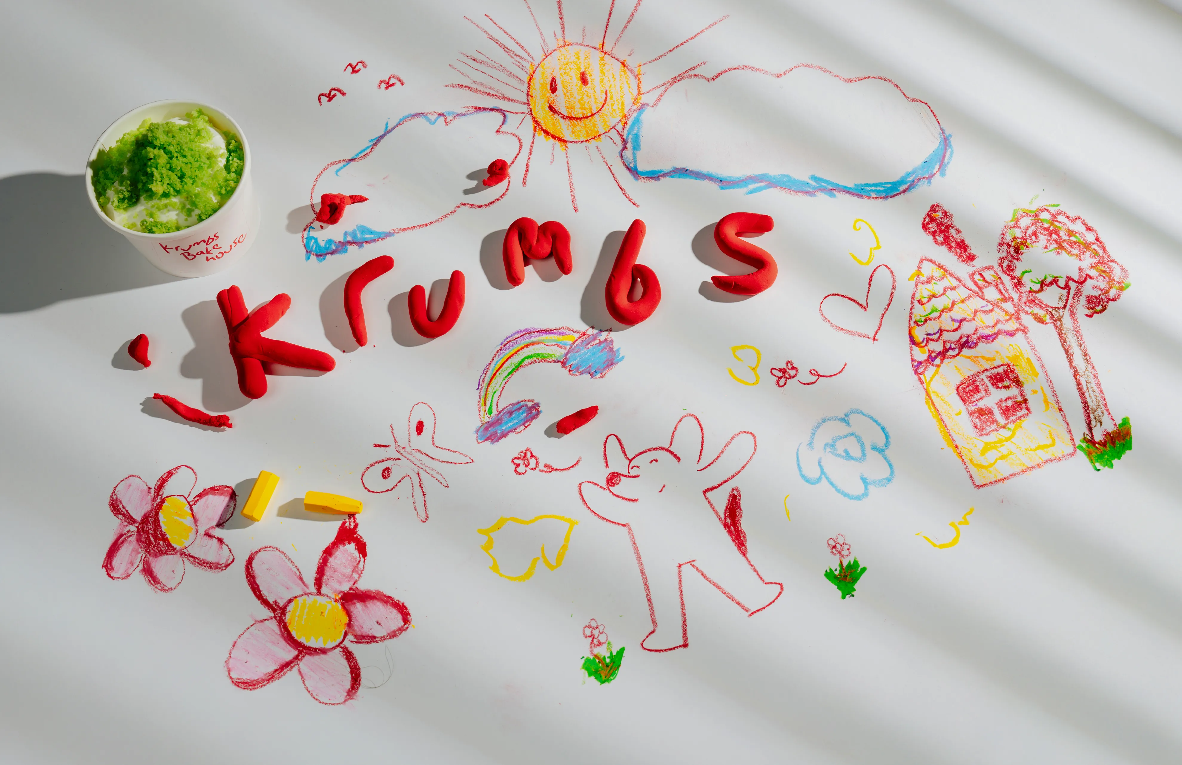
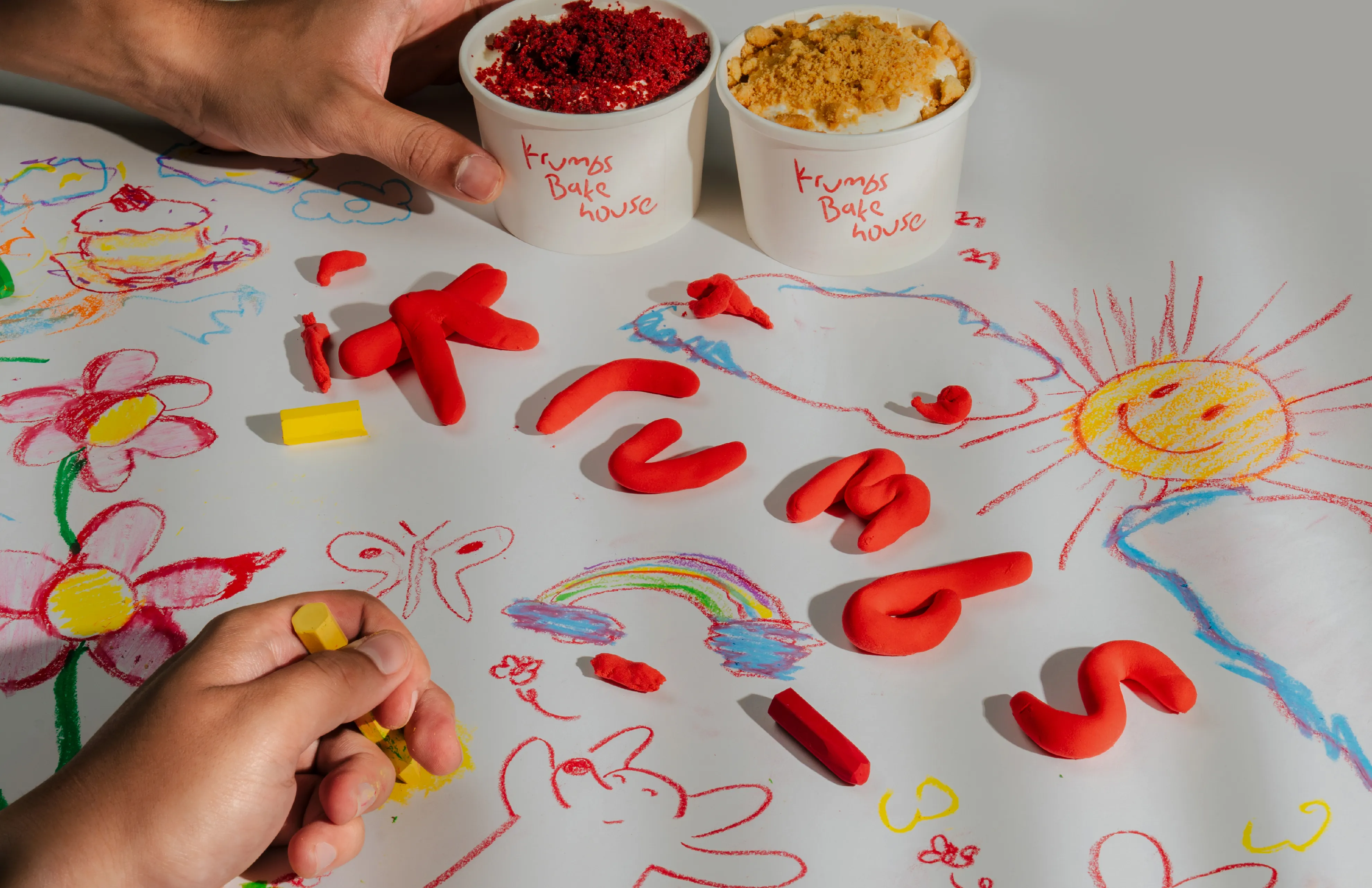
We anchored Krumbs' playful rebrand in Baké, a mascot inspired by the owner’s Great Dane. Crayon textures and childlike tones make the identity feel less like business, more like a friend.
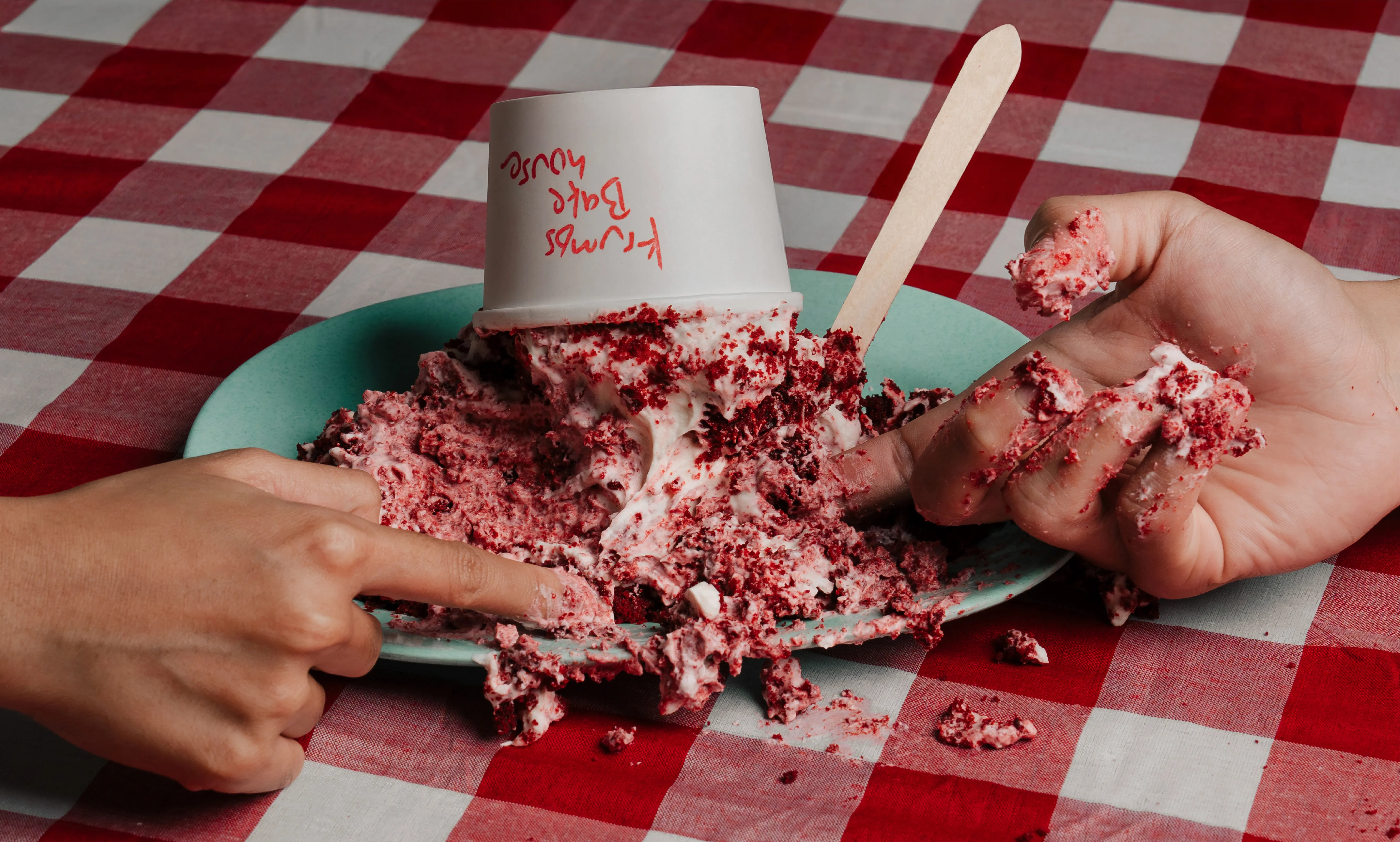
KRUMBS BAKEHOUSE
Dwita approached us for a rebrand of her bakehouse. She felt the previous identity no longer matched her vision; she wanted a brand that was more human, full of joy, and unmistakably playful.
FINDING THE RIGHT FIT
Dwita knew the "vibe" she wanted, but wasn't sure how it should take form. We began by diving into her life and aspirations, moving past standard business objectives. Initially, we interpreted her desire for a 'human' touch through a crayon-textured logotype reminiscent of childhood drawings. But as the design took shape, we sensed a gap. The aesthetic was playful, yet it lacked a specific anchor to Dwita herself. We needed more than just a style; we needed a story.
A WOMAN'S BEST FRIEND
To find that missing piece, we sat down with Dwita again. One of the main insights from this discussion was her deep love for her pets, specifically Shiro, her Great Dane. Shiro was her best friend—a gentle, goofy giant. Although Shiro had passed away, the memory of his warmth remained a vivid source of joy for her. We realized the best way to honor that bond and infuse the brand with genuine emotion, was to make Shiro the face of Krumbs.
MEET BAKÉ
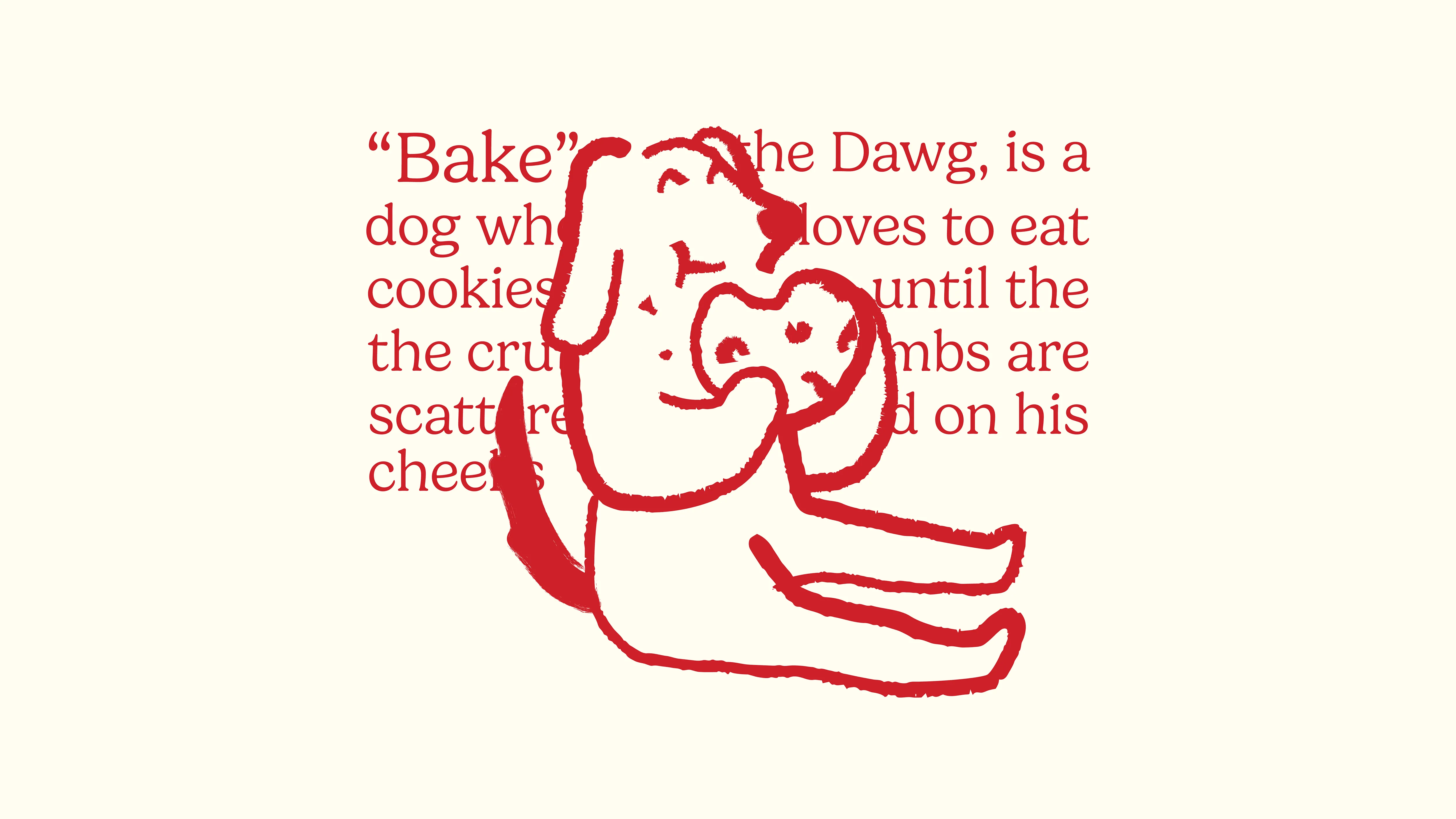
We explored several mascot options to translate Shiro into a brand icon, experimenting with facial expressions, stroke weights, and art styles. Ultimately, we landed on a design featuring hanging ears and a posture that mimics a human eating a cookie. This gave the character an approachable, relatable charm. To complete the persona, Dwita named the mascot Baké.
BRINGING IT ALL TOGETHER
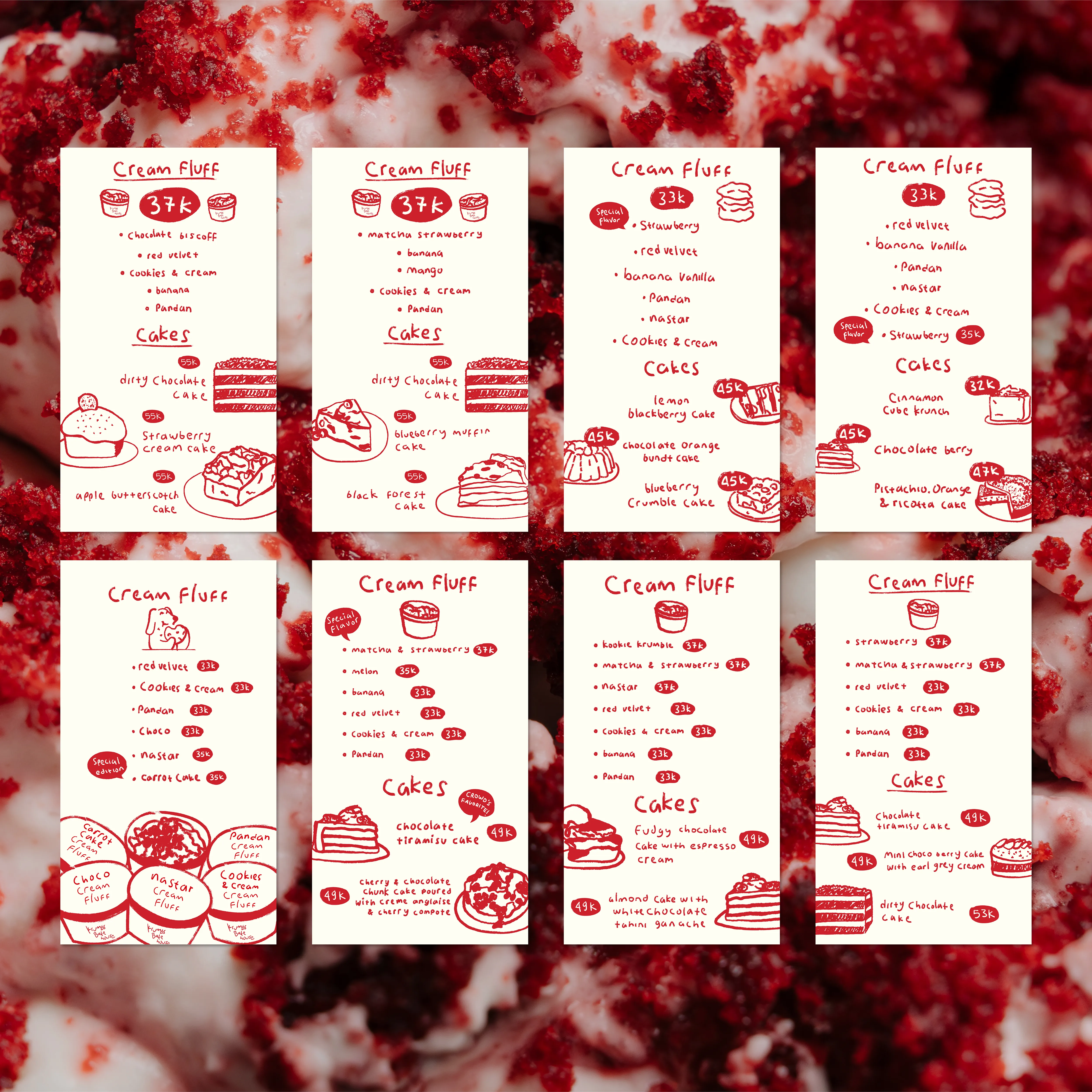
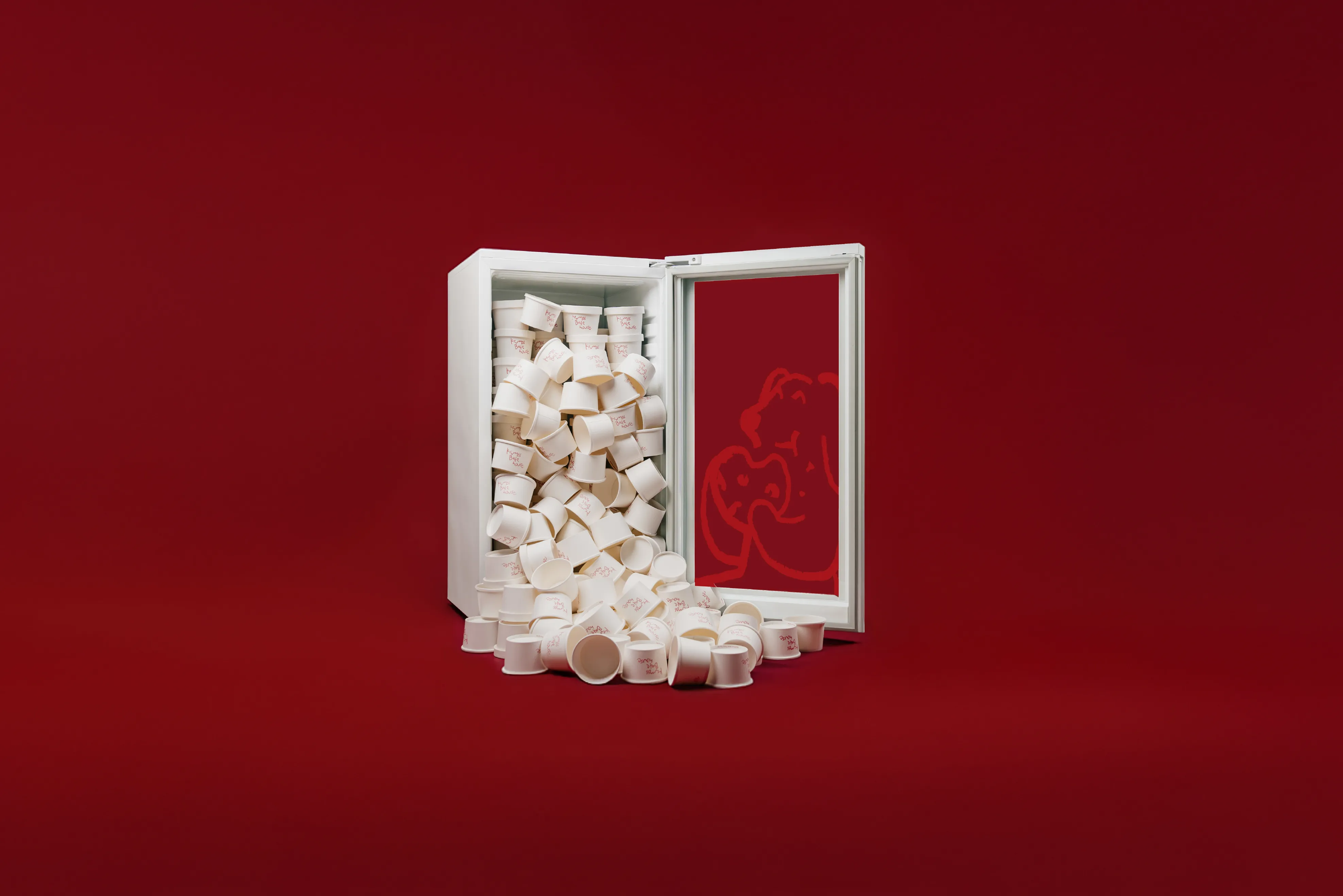
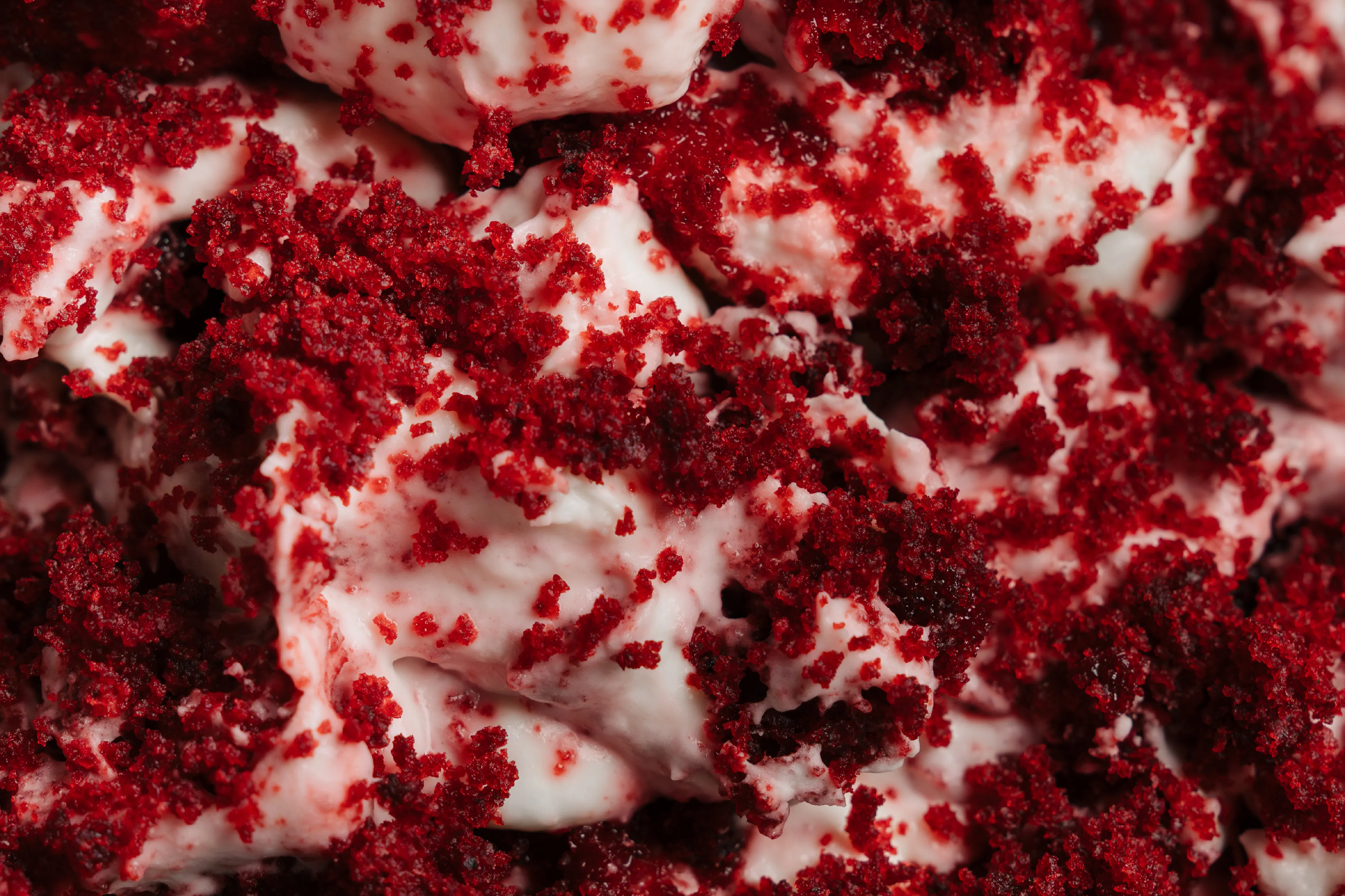
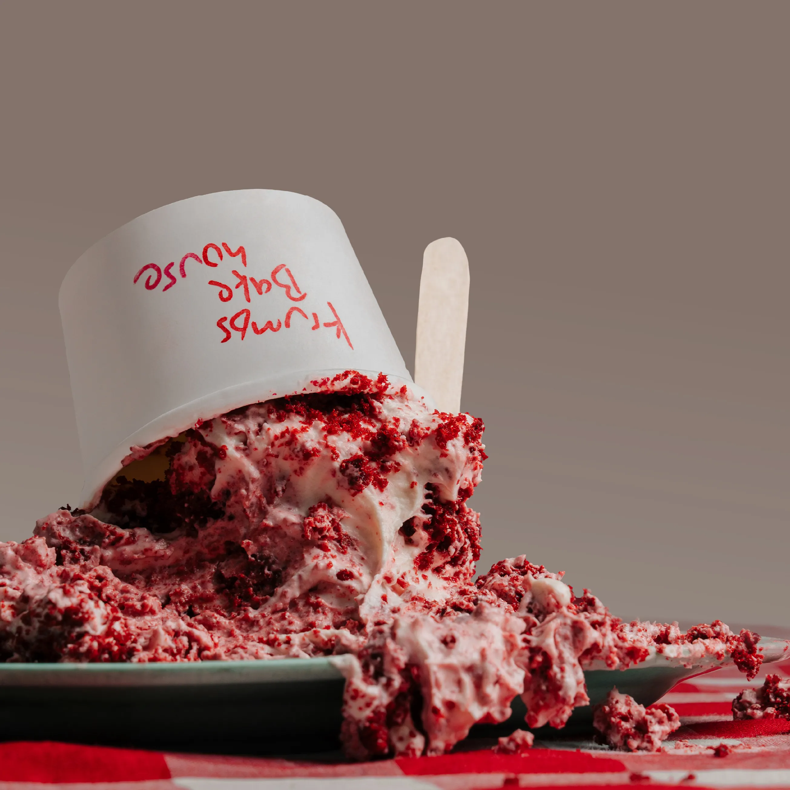
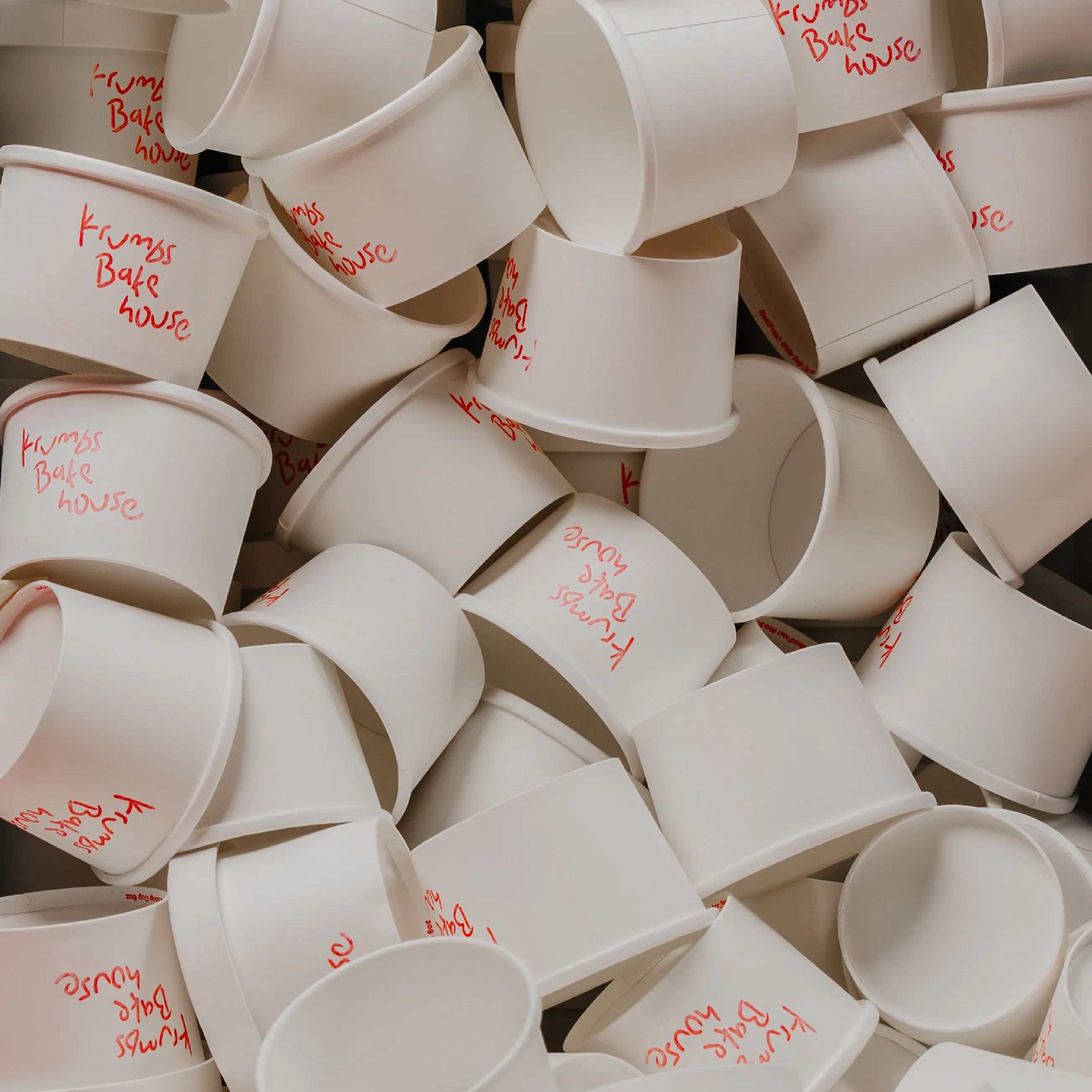
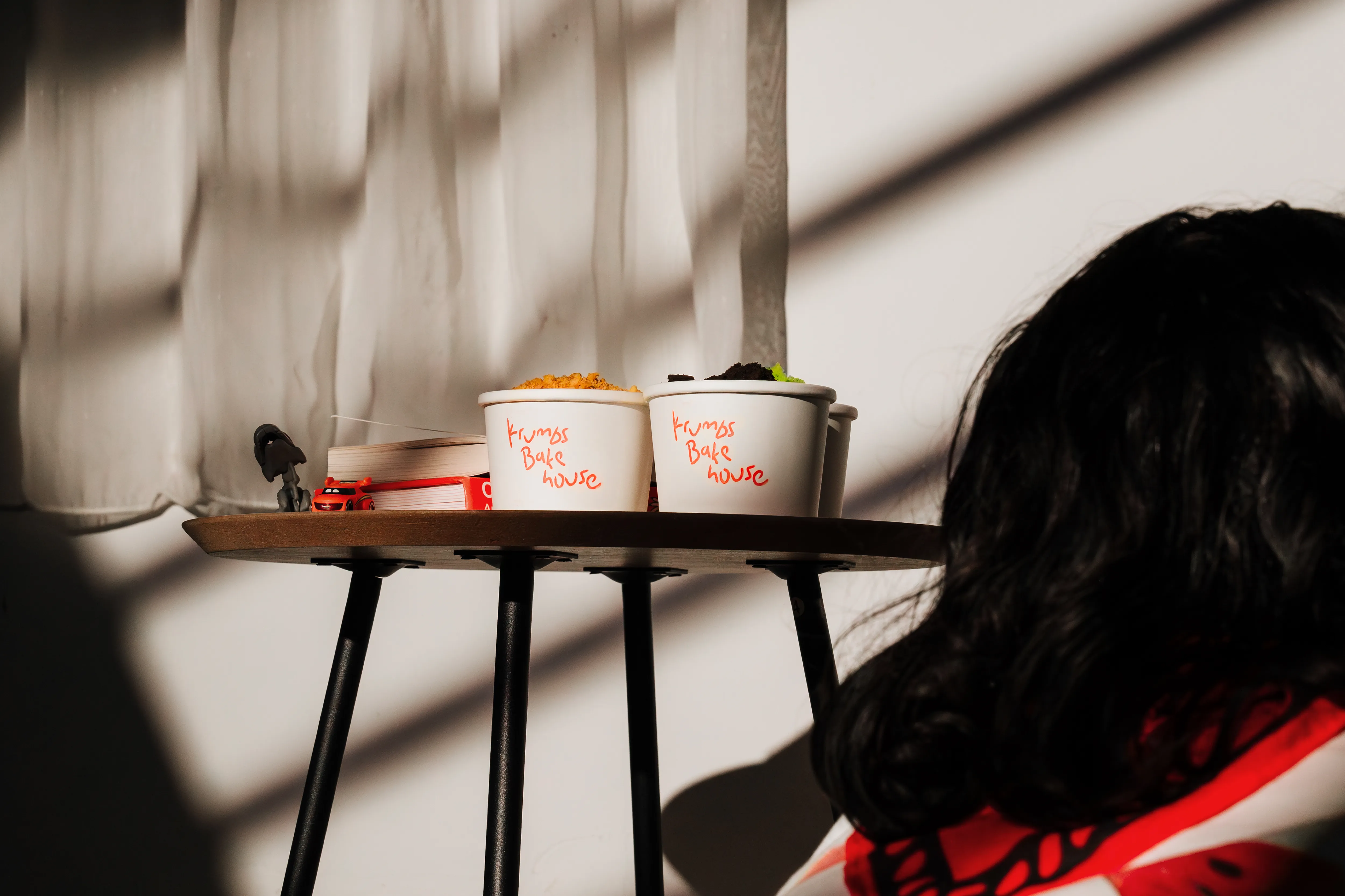
With the visual elements in place, we paired the crayon-style logotype and the mascot with a distinctly childish personality. To ensure the aesthetic remained effortless and less forced, we created a physical stamp of the logotype for use on cups and paper bags. We also adopted a "baby talk" tone for consumer-facing copy—using words like “Hewwo” and “Fwendds”—to emphasize innocence. Finally, we brought the brand to life with motion graphics of Baké eating cakes and going about his day, creating a brand that feels less like a business and more like a friend.
KRUMBS BAKEHOUSE
Dwita approached us for a rebrand of her bakehouse. She felt the previous identity no longer matched her vision; she wanted a brand that was more human, full of joy, and unmistakably playful.
FINDING THE RIGHT FIT
Dwita knew the "vibe" she wanted, but wasn't sure how it should take form. We began by diving into her life and aspirations, moving past standard business objectives. Initially, we interpreted her desire for a 'human' touch through a crayon-textured logotype reminiscent of childhood drawings. But as the design took shape, we sensed a gap. The aesthetic was playful, yet it lacked a specific anchor to Dwita herself. We needed more than just a style; we needed a story.
A WOMAN'S BEST FRIEND
To find that missing piece, we sat down with Dwita again. One of the main insights from this discussion was her deep love for her pets, specifically Shiro, her Great Dane. Shiro was her best friend—a gentle, goofy giant. Although Shiro had passed away, the memory of his warmth remained a vivid source of joy for her. We realized the best way to honor that bond and infuse the brand with genuine emotion, was to make Shiro the face of Krumbs.
MEET BAKÉ
We explored several mascot options to translate Shiro into a brand icon, experimenting with facial expressions, stroke weights, and art styles. Ultimately, we landed on a design featuring hanging ears and a posture that mimics a human eating a cookie. This gave the character an approachable, relatable charm. To complete the persona, Dwita named the mascot Baké.
BRINGING IT ALL TOGETHER
With the visual elements in place, we paired the crayon-style logotype and the mascot with a distinctly childish personality. To ensure the aesthetic remained effortless and less forced, we created a physical stamp of the logotype for use on cups and paper bags. We also adopted a "baby talk" tone for consumer-facing copy—using words like “Hewwo” and “Fwendds”—to emphasize innocence. Finally, we brought the brand to life with motion graphics of Baké eating cakes and going about his day, creating a brand that feels less like a business and more like a friend.