
Putu Suel Moris Sudiarsana
Putu Kamaiso Chekitana
Petrus Daniel Widi
Kadek Wisnu Leonardo Maldiny
Wayan Krisna Sangging Wiguna
Dewa Ayu Diah Nala
Kuta Angel Hotel wanted to update their brand while preserving their reputation for warm hospitality, our refresh brought their visual identity in line with the quality of their guest experience.




THE CHALLANGE
The previous logomark and outdated signage no longer reflected the hotel's refined atmosphere. A new identity had to signal calm comfort while still feeling elegant.
THE SOLUTION
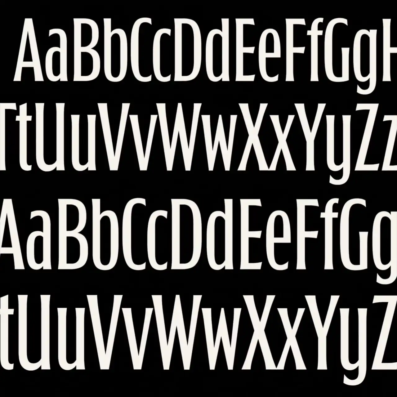
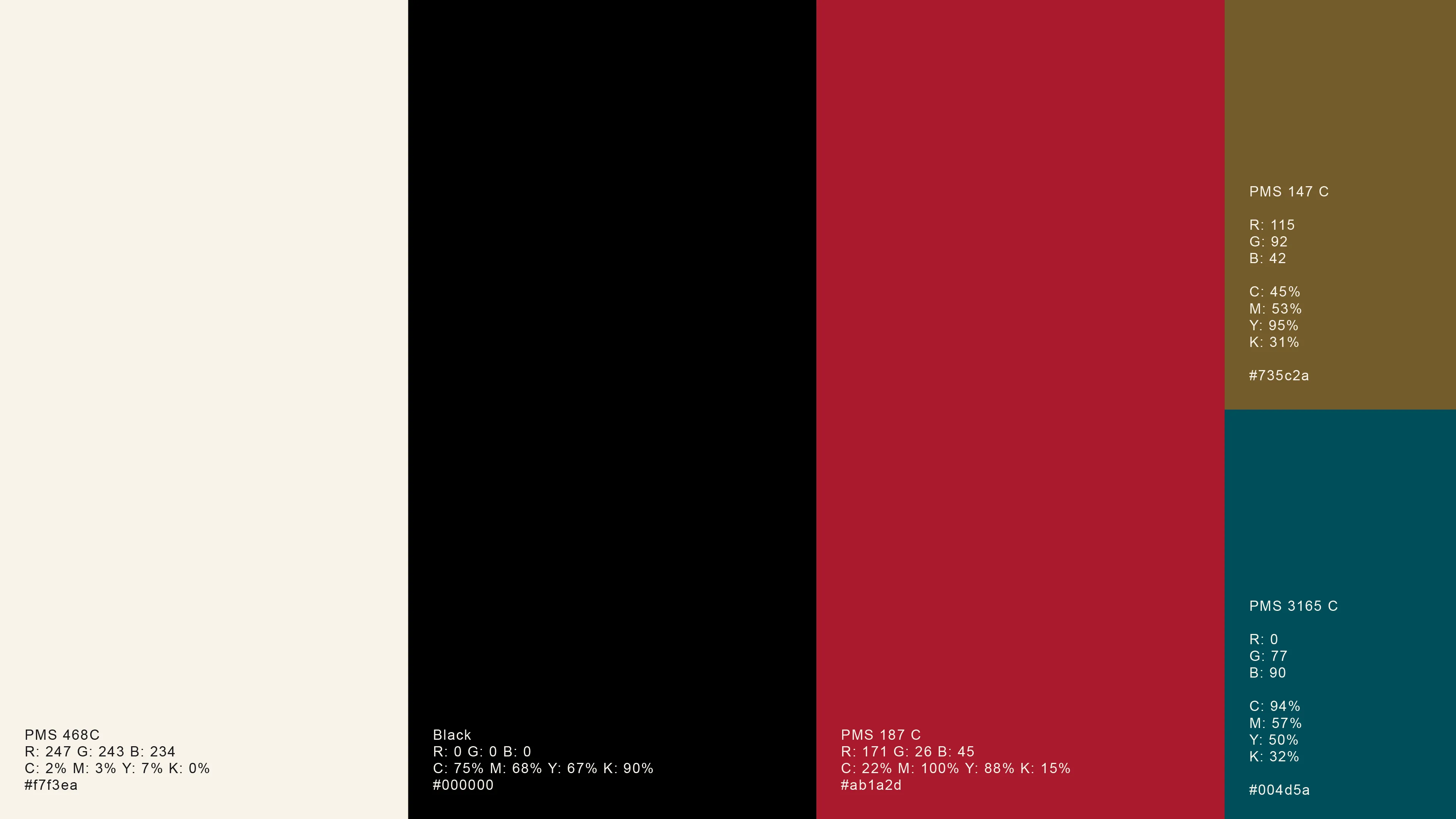
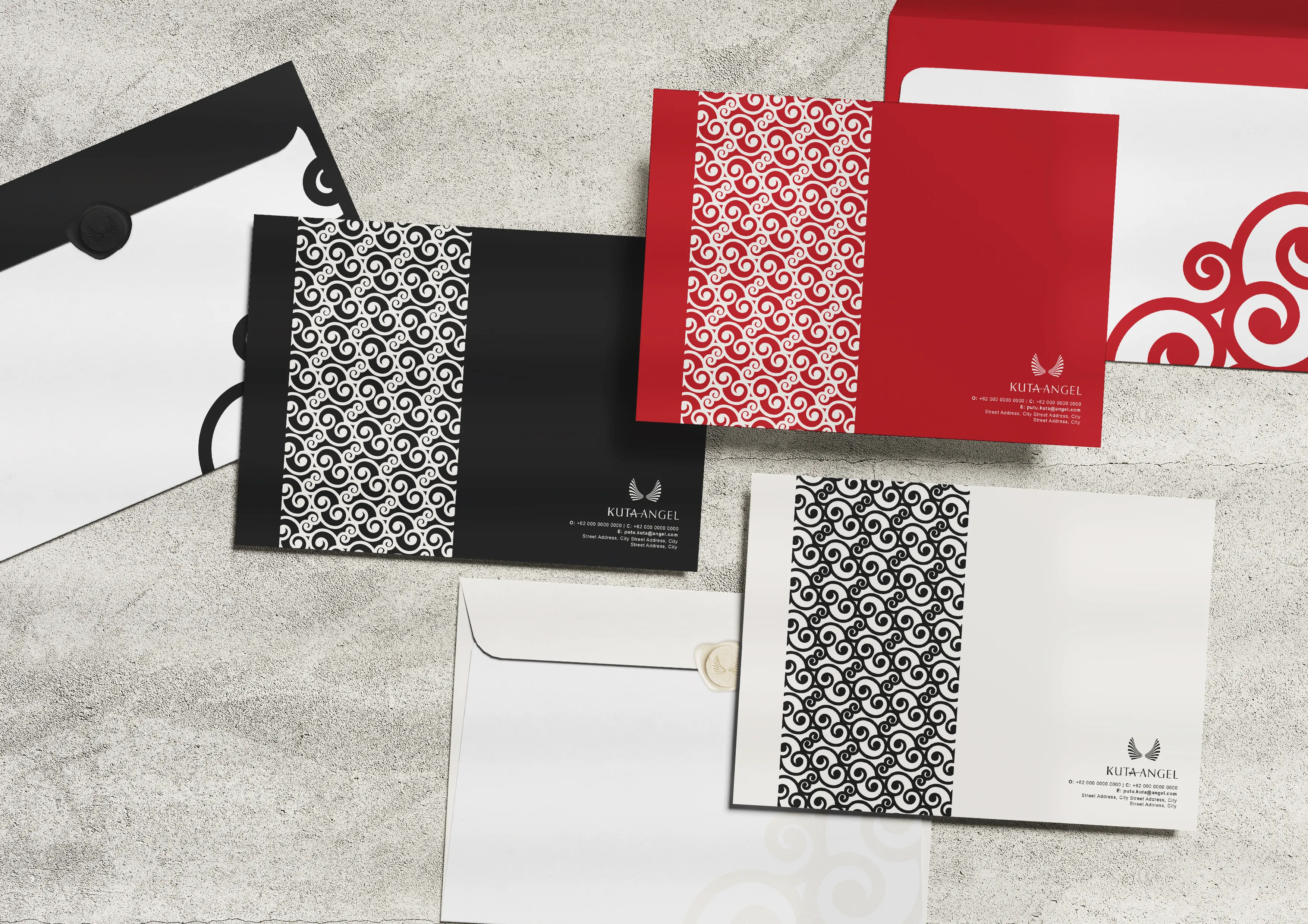
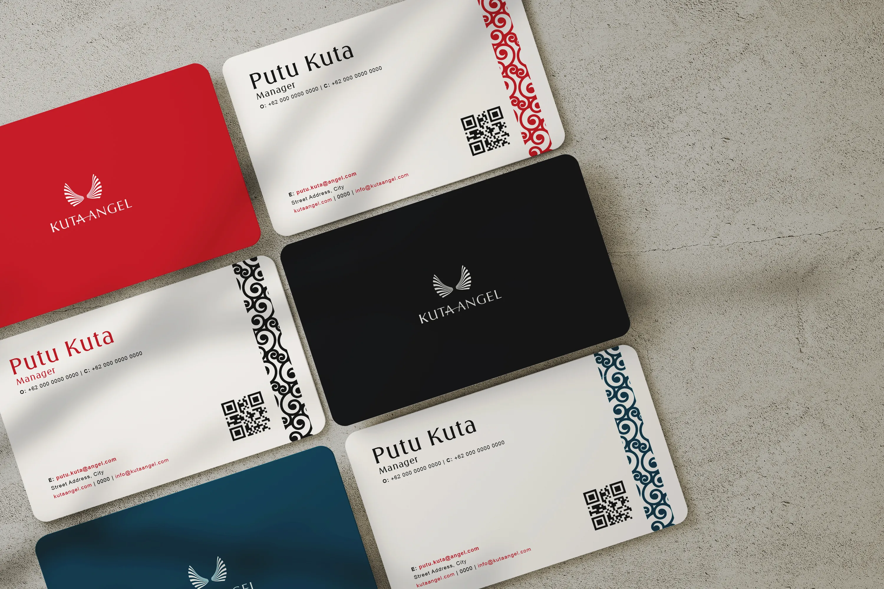
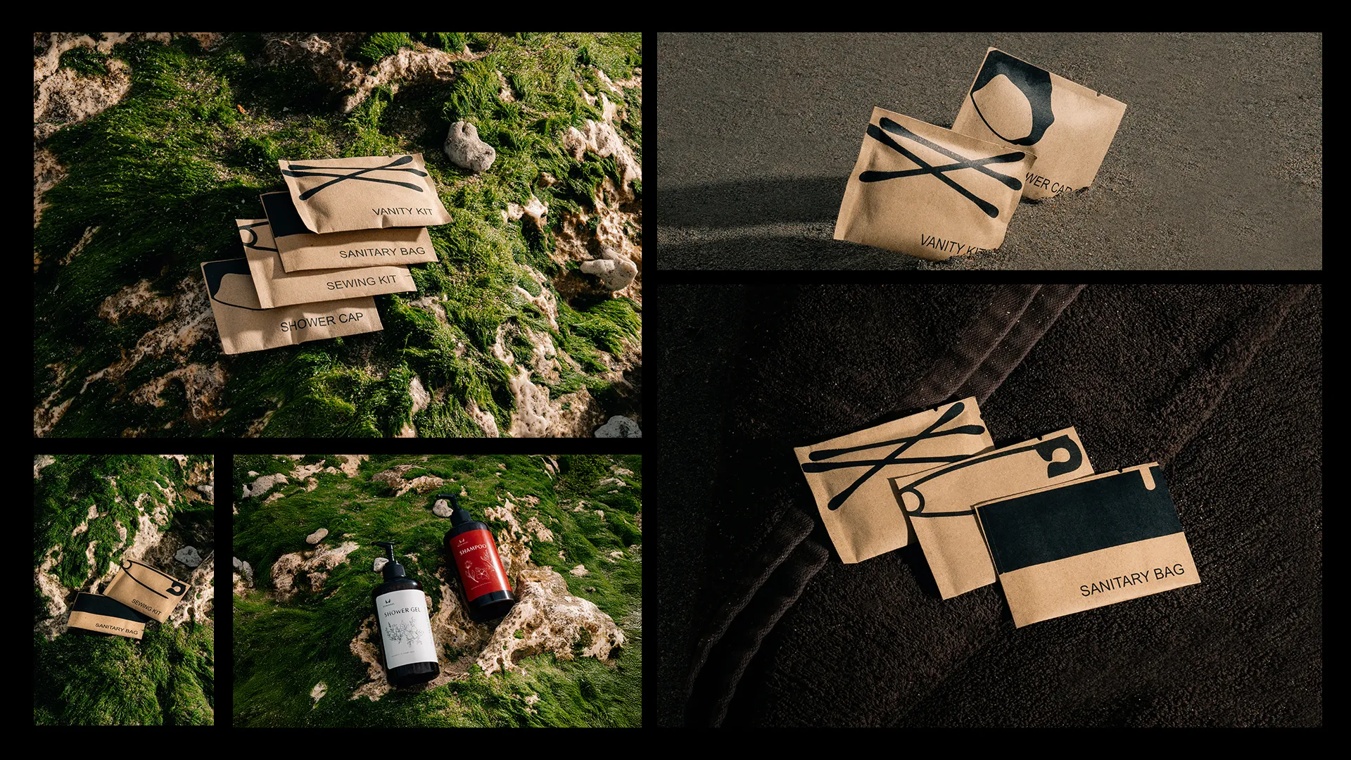
We changed the imagery of the angel towards a more universal symbol, its wings. The palette follows its existing identity, cream, onyx, deep teal and sunset red. Arnika Variable serves as the primary typeface for signage and print, paired with Arial for body copy. To complete the identity, we used Balinese filigree as the base for the brand's pattern.
THE BRAND IN ACTION
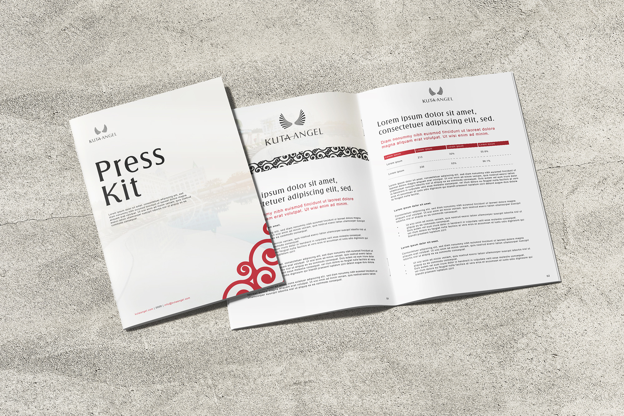
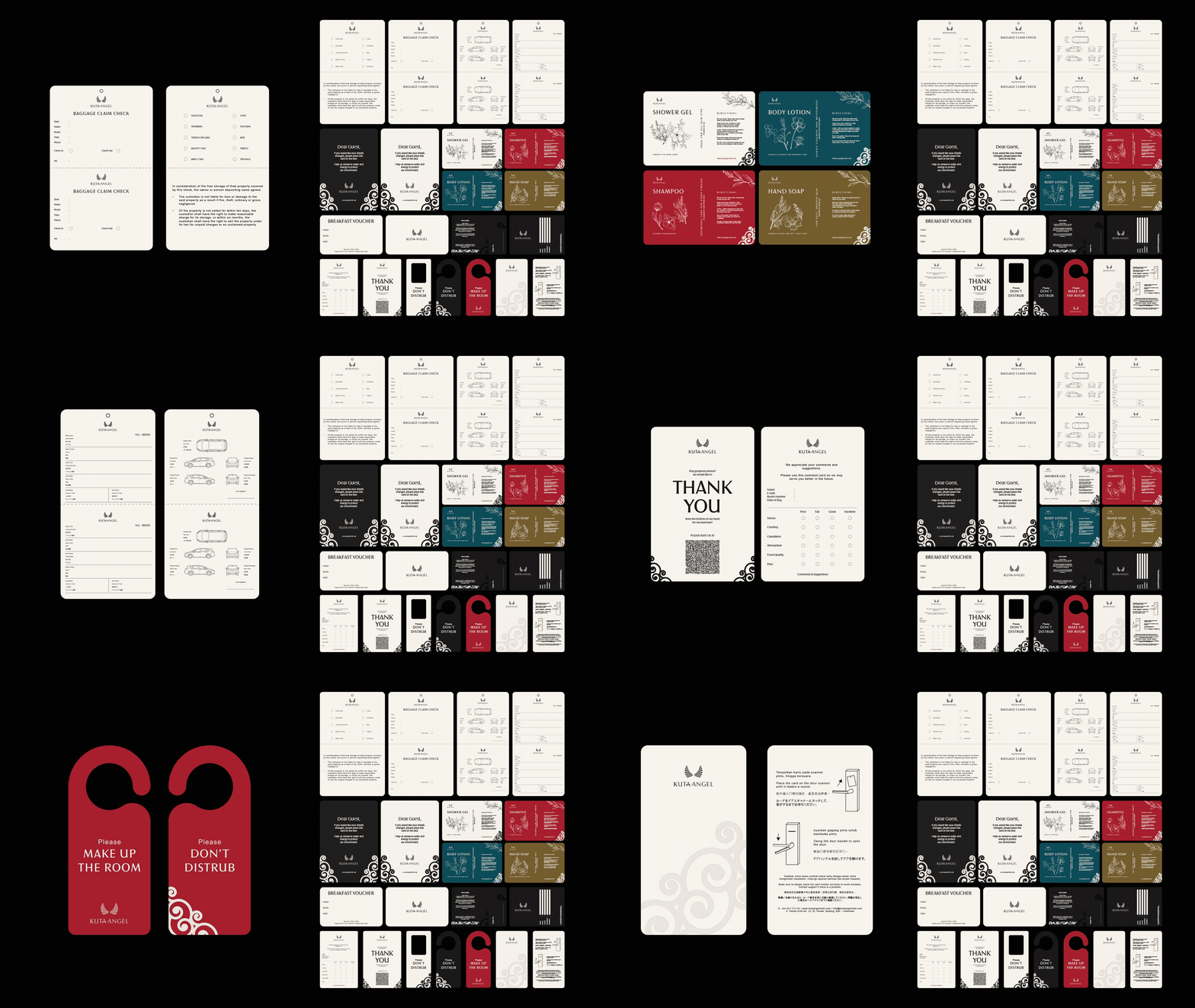
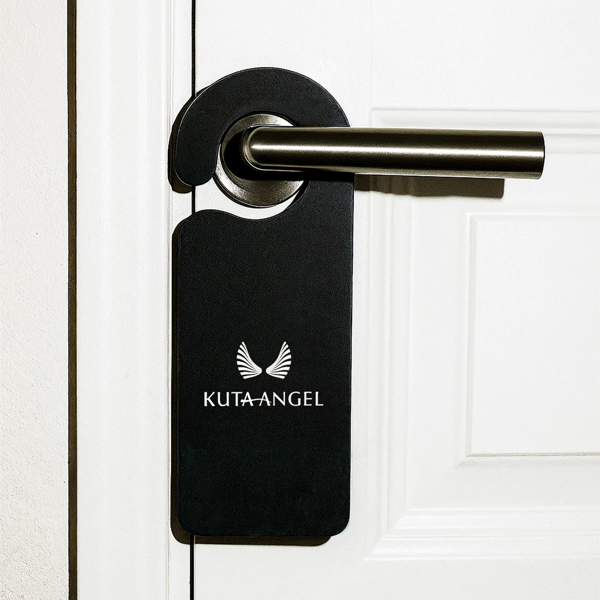
Way-finding plaques, finished in matte black, suite names in silver. The printed press kit appears on textured cream stock with a faint wing watermark. We created the envelopes, linen-change cards and do-not-disturb hangers to fit the hotel's new identity. Our copy stays bright, calm and assured, reflecting the staff's warmth. Public language uses the headline "A Boutique Hotel Experience in the Heart of Kuta," drawn from the official company profile, and keeps guest messages simple.
THE POWER OF SIMPLICITY
A single stroke, a colorful but subdued palette and disciplined typography turned noise into calm. Now every sign, card and post delivers the restful promise guests have always felt inside Kuta Angel.
IMPACT
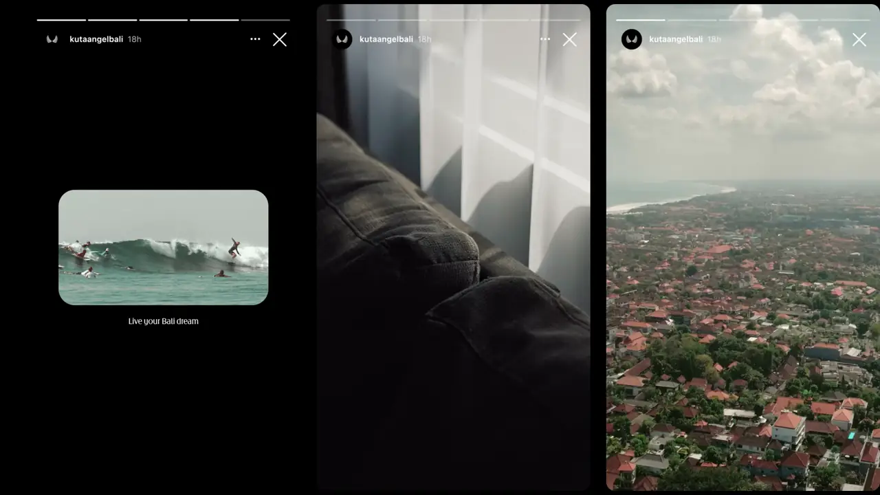
Instagram reach grew from 537 unique accounts in November 2024 to 18.8k in March 2025. Profile visits followed, climbing to 902 in March. By April the follower count had passed 2,278, all gained organically.