Putu Suel Moris Sudiarsana
Putu Kamaiso Chekitana
Petrus Daniel Widi
Wayan Khrisna Sangging Wiguna
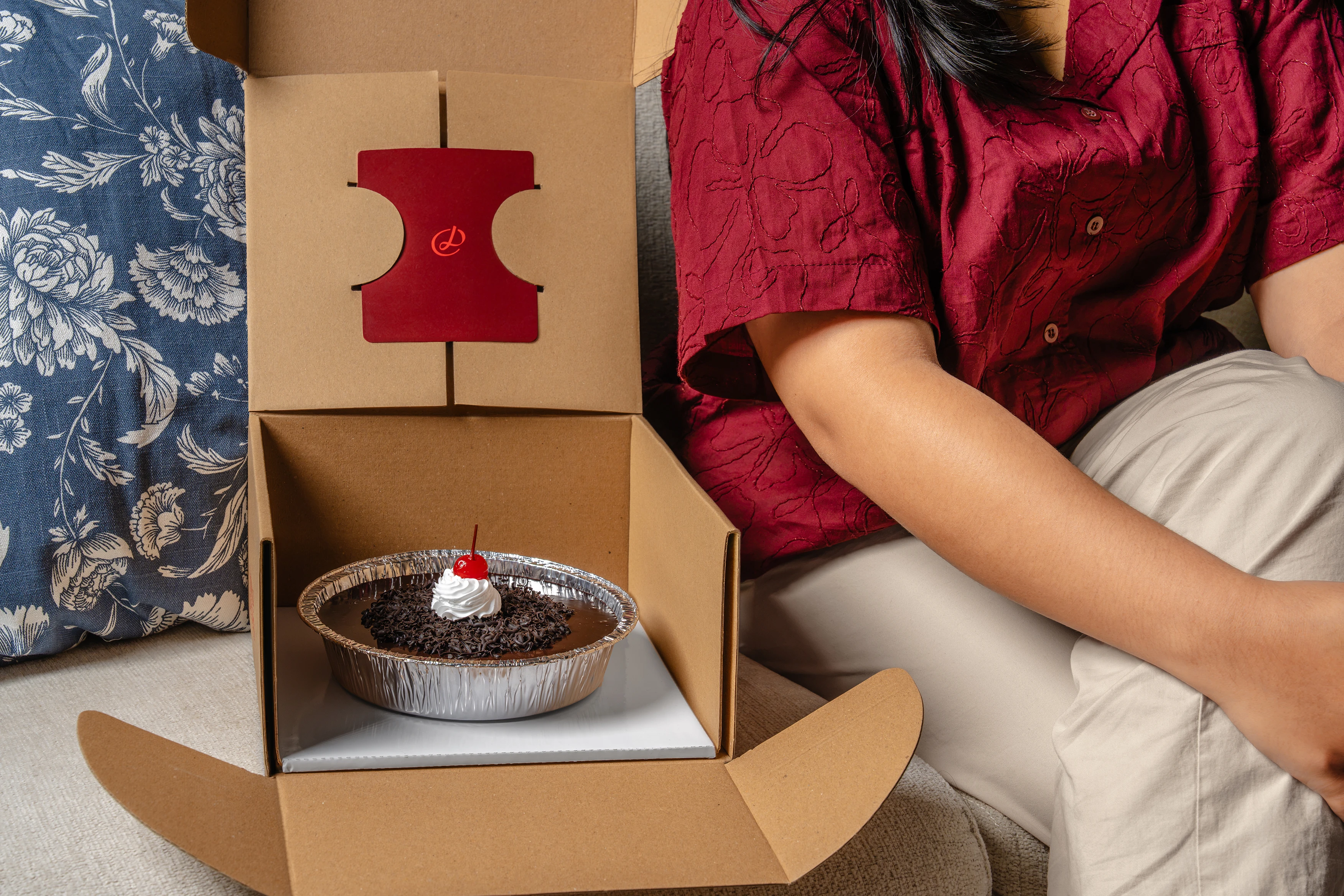
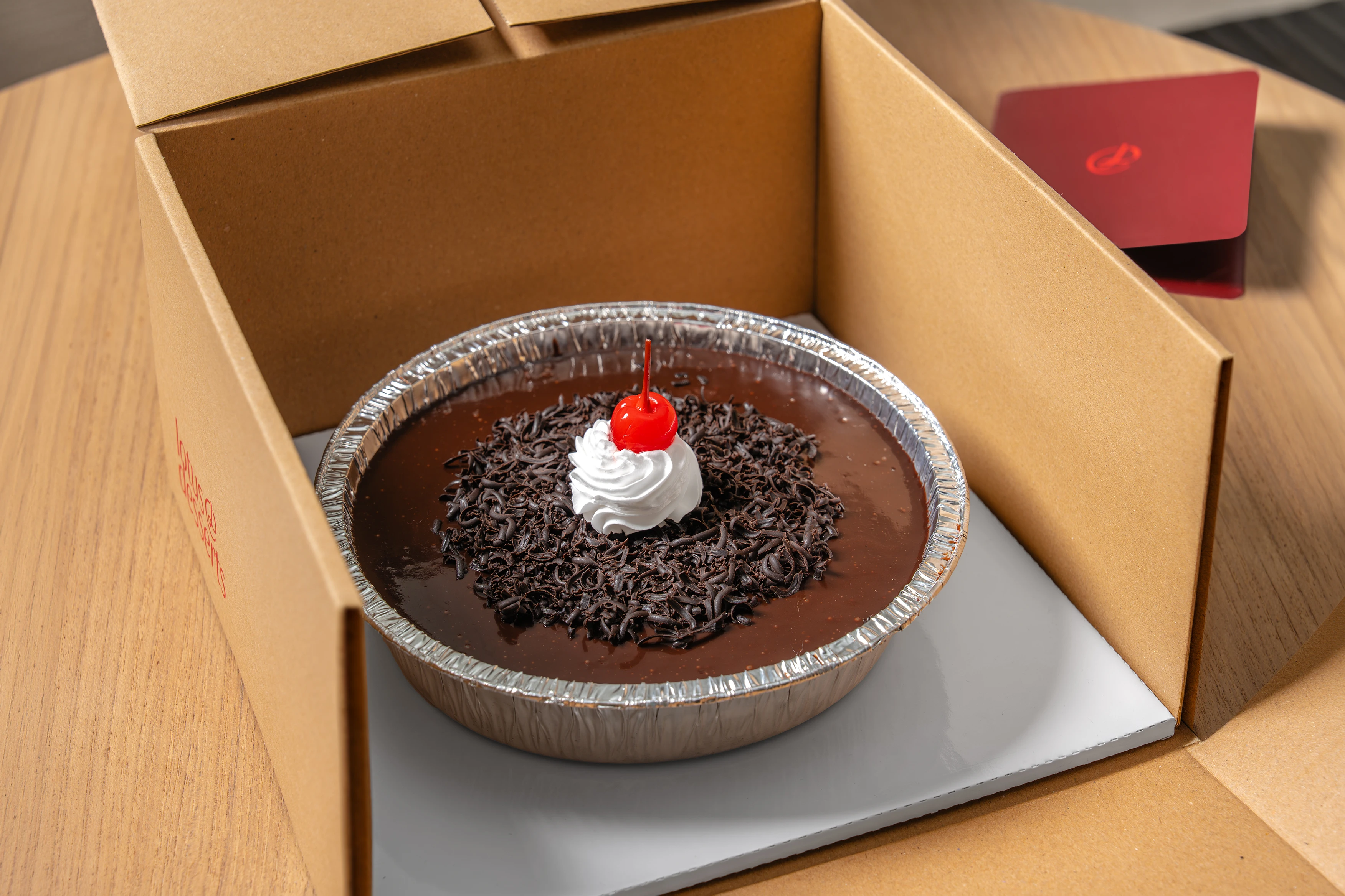
To shift Lotus Desserts to daily offerings, we crafted a "grounded luxury" identity. By contrasting Dark Cherry elegance with raw cardboard packaging, we balanced European refinement with accessible, everyday enjoyment.

.gif)
LOTUS DESSERTS
In early 2025, our friends at Lotus Desserts approached us with a desire to evolve. For years, they had built a reputation on custom cakes—a model that was successful but demanding. They wanted to shift toward a more sustainable model focused on readily available baked goods. The problem was that their existing identity was too narrow; it screamed "special occasion" and lacked the flexibility to embrace this broader, everyday vision. They challenged us to break that mold.
ELEGANCE IN EVOLUTION
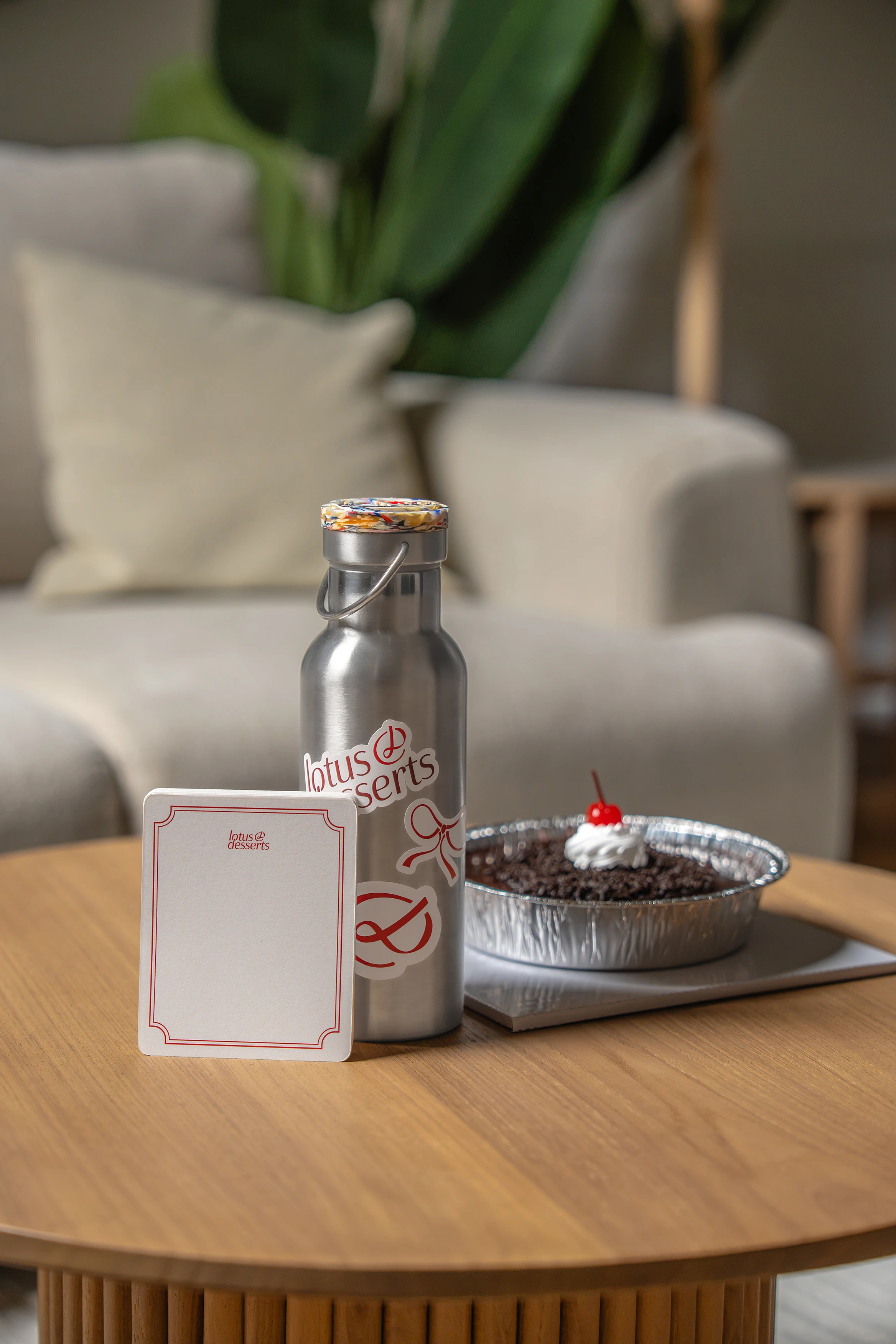
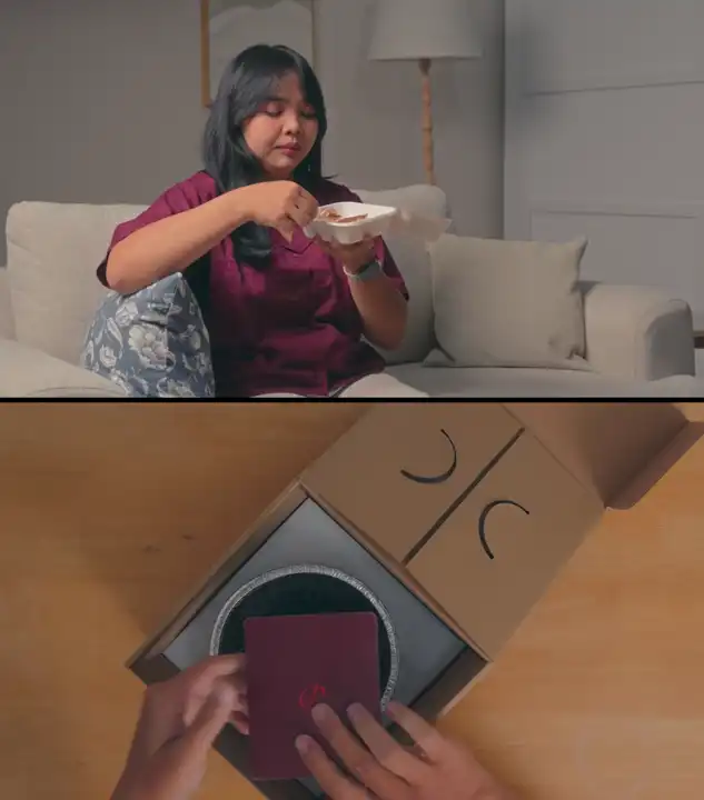
Strategy-wise, we wanted the brand to be a direct reflection of the owner: refined, elegant, and ready to embrace change. Even though the business model was shifting to "readily available," the transaction shouldn't feel instant or cheap. We wanted the audience to feel deeply cared for, so we introduced personalized touchpoints—like greeting and handling cards—to ensure that every buyer feels a lingering connection to the baker.
RICHNESS AND RESTRAINT
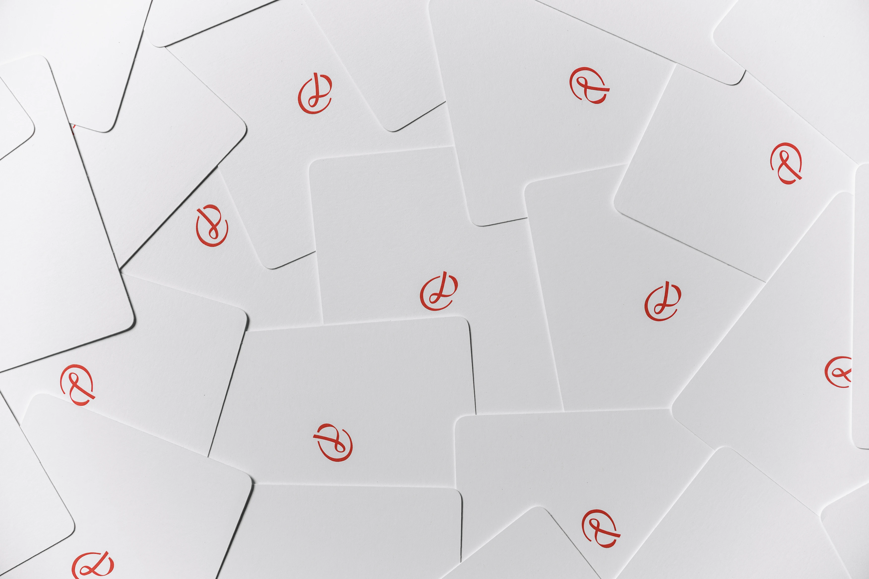
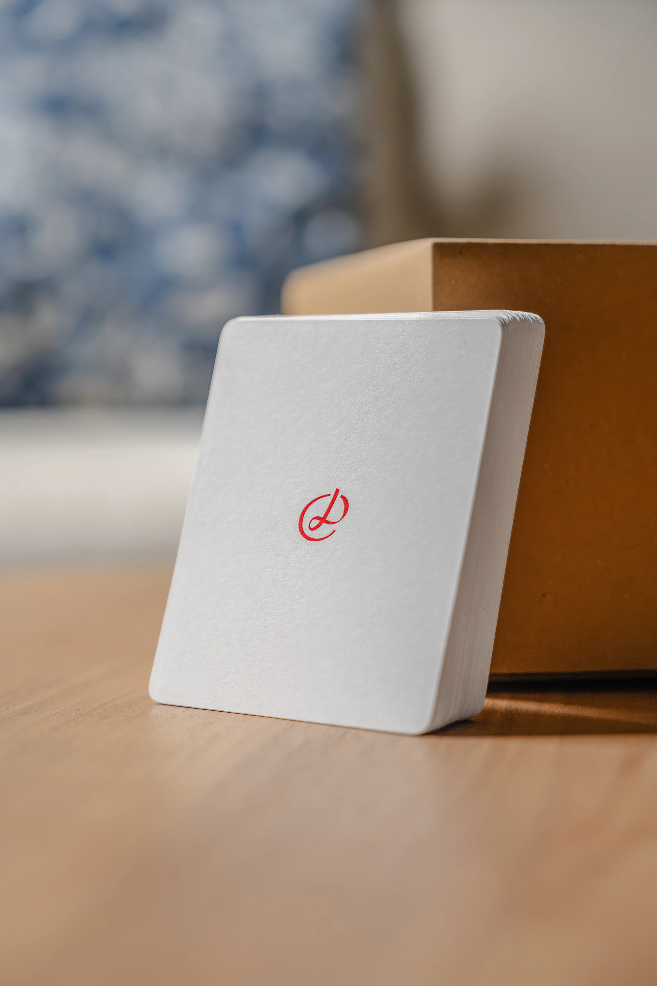
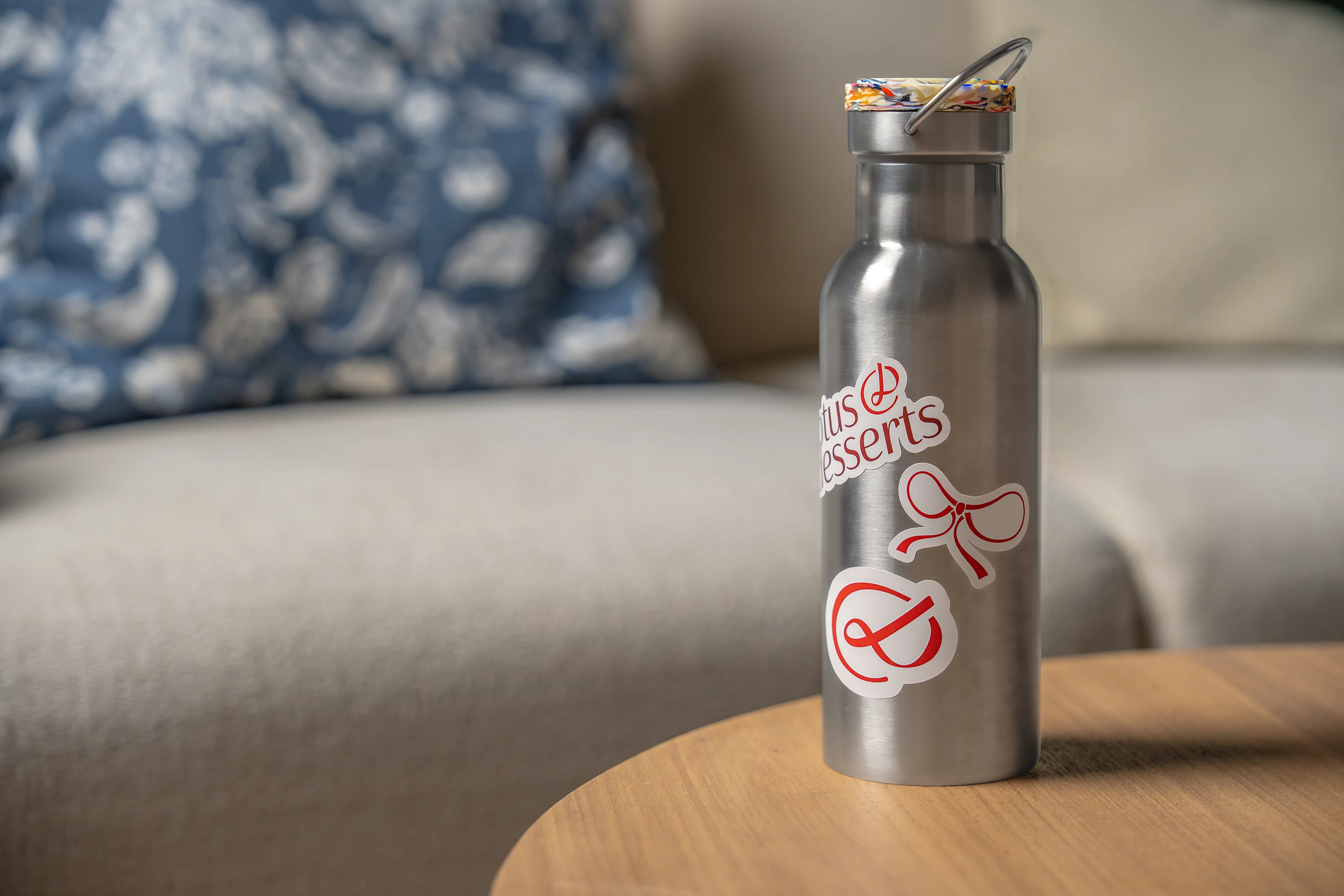
To translate this refinement visually, we looked to the timeless cues of European luxury. We selected a palette of Dark Cherry Red and Cream White to signal a depth of quality and experience, grounding the brand in something rich and timeless. We paired these colors with intricate symbols and wax seals, creating a visual language that feels steep in tradition.
GROUNDED LUXURY
However, a crucial part of the brief was accessibility. We didn't want the brand to become so "premium" that it felt out of reach for daily enjoyment. To balance the sophisticated palette and European motifs, we deliberately utilized raw cardboard for the packaging. This contrast—high-end branding on humble materials—created a "grounded luxury" that welcomes customers in, promising that while the experience is elevated, it is meant to be accessible.
LOTUS DESSERTS
In early 2025, our friends at Lotus Desserts approached us with a desire to evolve. For years, they had built a reputation on custom cakes—a model that was successful but demanding. They wanted to shift toward a more sustainable model focused on readily available baked goods. The problem was that their existing identity was too narrow; it screamed "special occasion" and lacked the flexibility to embrace this broader, everyday vision. They challenged us to break that mold.
ELEGANCE IN EVOLUTION
Strategy-wise, we wanted the brand to be a direct reflection of the owner: refined, elegant, and ready to embrace change. Even though the business model was shifting to "readily available," the transaction shouldn't feel instant or cheap. We wanted the audience to feel deeply cared for, so we introduced personalized touchpoints—like greeting and handling cards—to ensure that every buyer feels a lingering connection to the baker.
RICHNESS AND RESTRAINT
To translate this refinement visually, we looked to the timeless cues of European luxury. We selected a palette of Dark Cherry Red and Cream White to signal a depth of quality and experience, grounding the brand in something rich and timeless. We paired these colors with intricate symbols and wax seals, creating a visual language that feels steep in tradition.
GROUNDED LUXURY
However, a crucial part of the brief was accessibility. We didn't want the brand to become so "premium" that it felt out of reach for daily enjoyment. To balance the sophisticated palette and European motifs, we deliberately utilized raw cardboard for the packaging. This contrast—high-end branding on humble materials—created a "grounded luxury" that welcomes customers in, promising that while the experience is elevated, it is meant to be accessible.