Putu Suel Moris Sudiarsana
Putu Kamaiso Chekitana
Petrus Daniel Widi
Kadek Wisnu Leonardo Maldiny
Wayan Krisna Sangging Wiguna
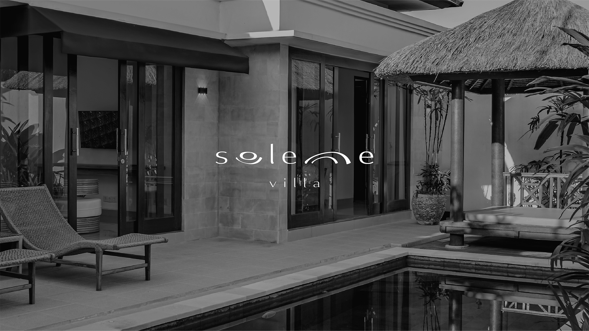
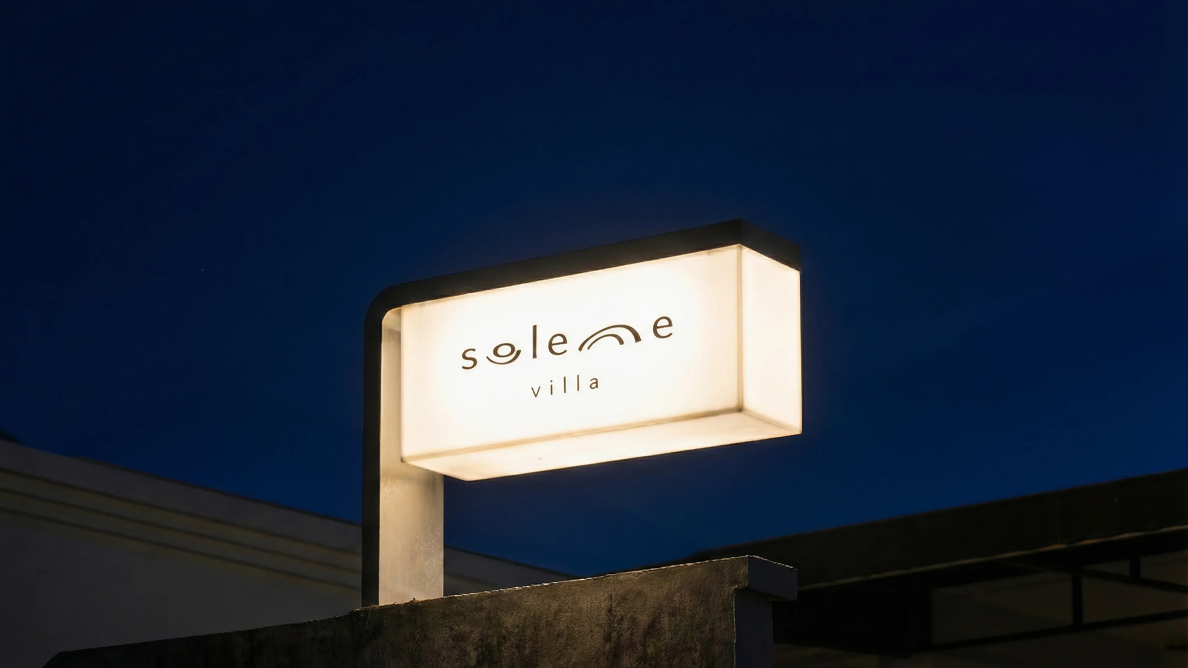
Our friend Bayu acquired a neglected villa in Lod Tunduh. We overhauled its identity and photography, visually transforming the abandoned property into a cohesive vision that honors its new life.
CHALLANGES
Bayu picked the name Solenne, a spin-off of the French word solennel (solemn), because he wanted guests to feel a sense of calm and tranquility. However, "serenity" has become a ubiquitous buzzword in Bali’s saturated villa market, and because of that, their identities often feel repetitive. We wanted Solenne to stand out—to possess an identity that is grounded, distinct, and truly fitting for Balinese culture. To do that, we had to dive deeper.
DIGGING DEEP
We explored synonyms to help craft an identity that could represent this concept of solemnity in a uniquely Balinese way. We moved beyond simple relaxation toward balance and harmony, discovering that these concepts are crucial in Balinese Hinduism. The Balinese observe a concept called Rwa Bhinneda, which literally means "Two Opposites", a philosophy deeply ingrained within our culture.
Rwa Bhinneda calls for a balance in all things, whether work and leisure, order and chaos, or tradition and progress. We wanted to instill this harmony into Solenne's identity, hoping guests would feel the intention and reverence behind the brand. Now that we had the brand's essence, we needed it to take form.
THE FORM
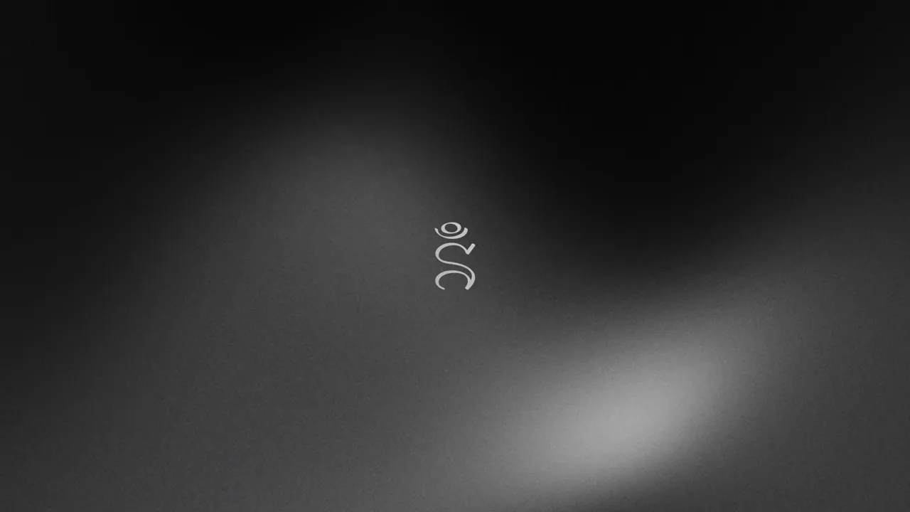
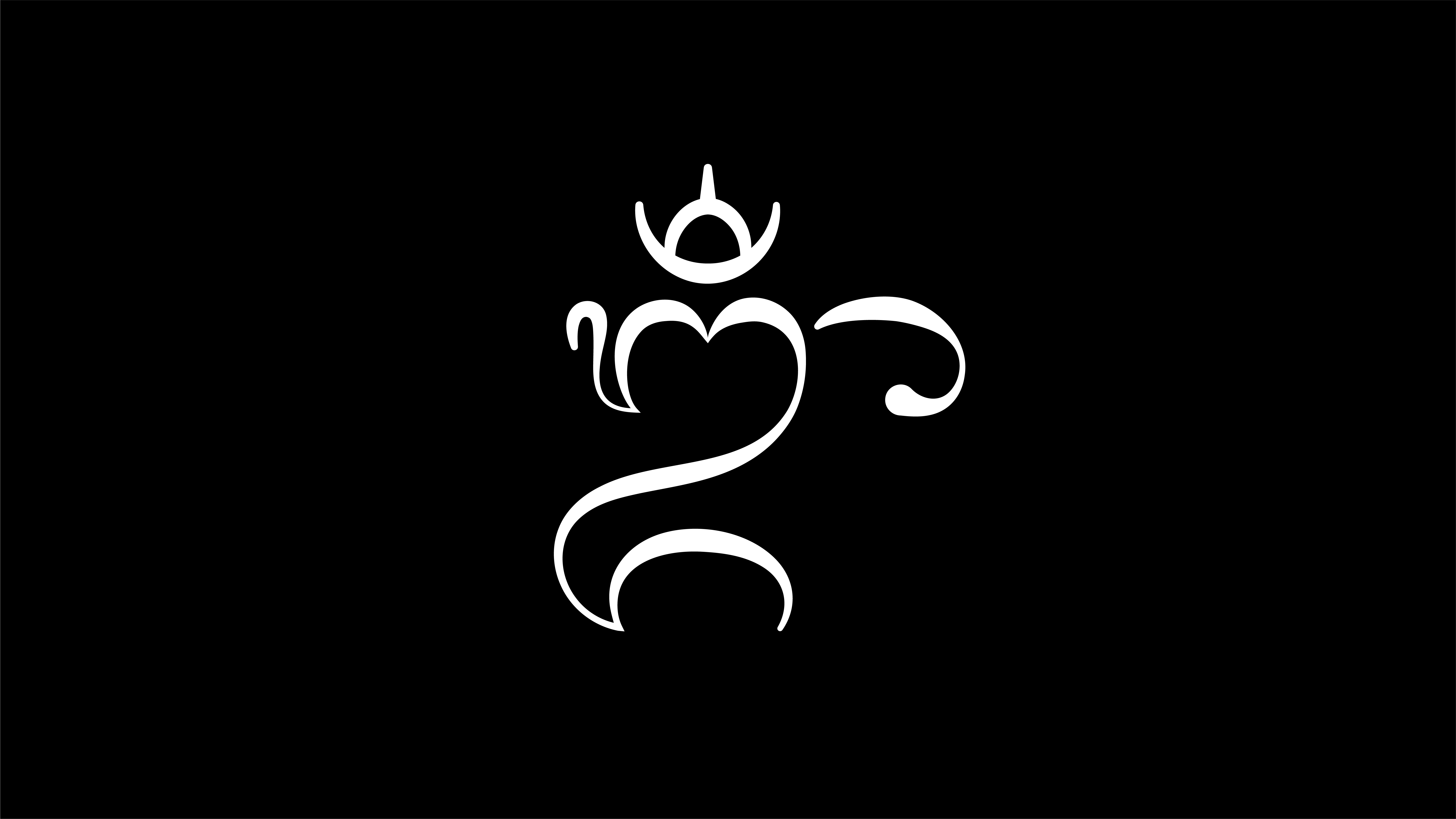
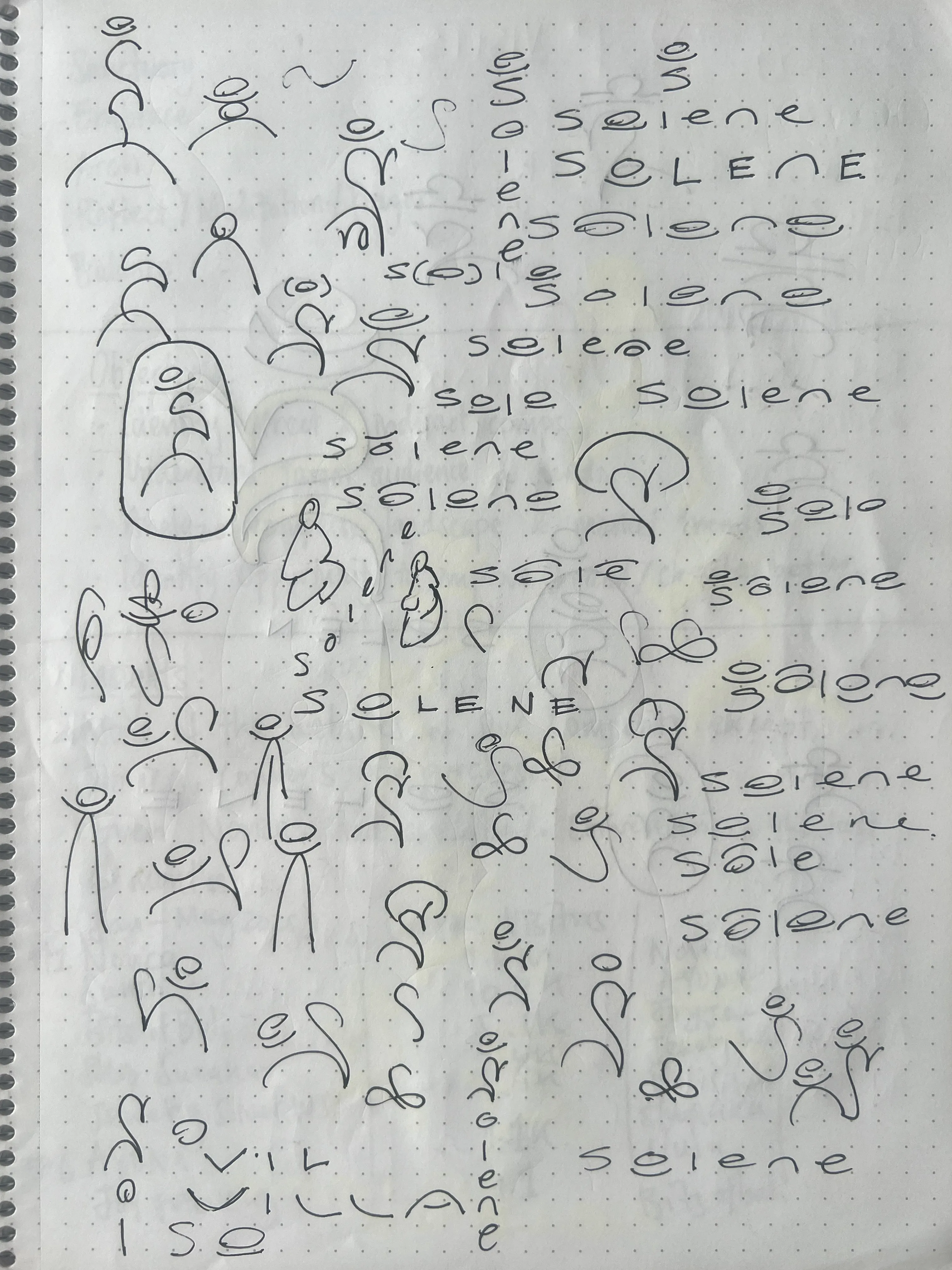
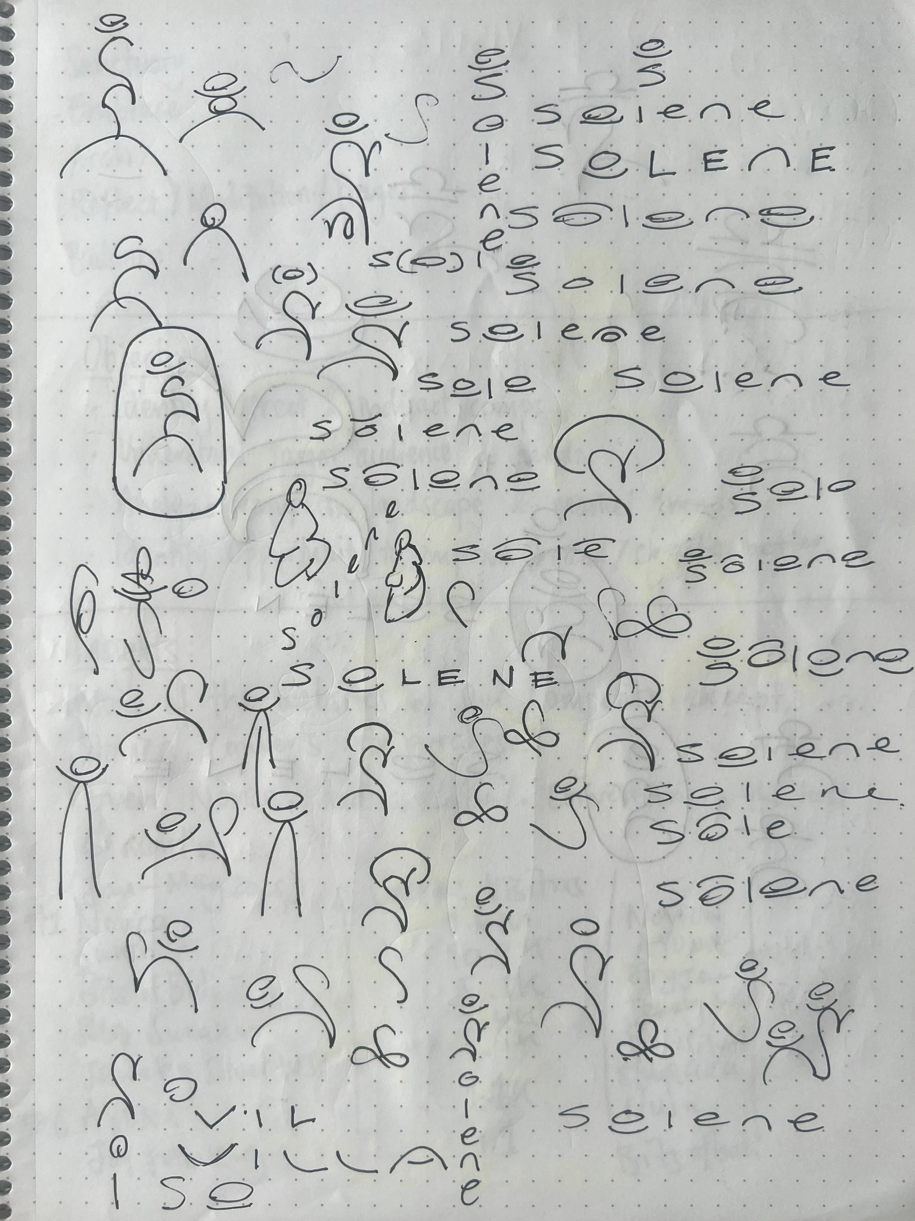
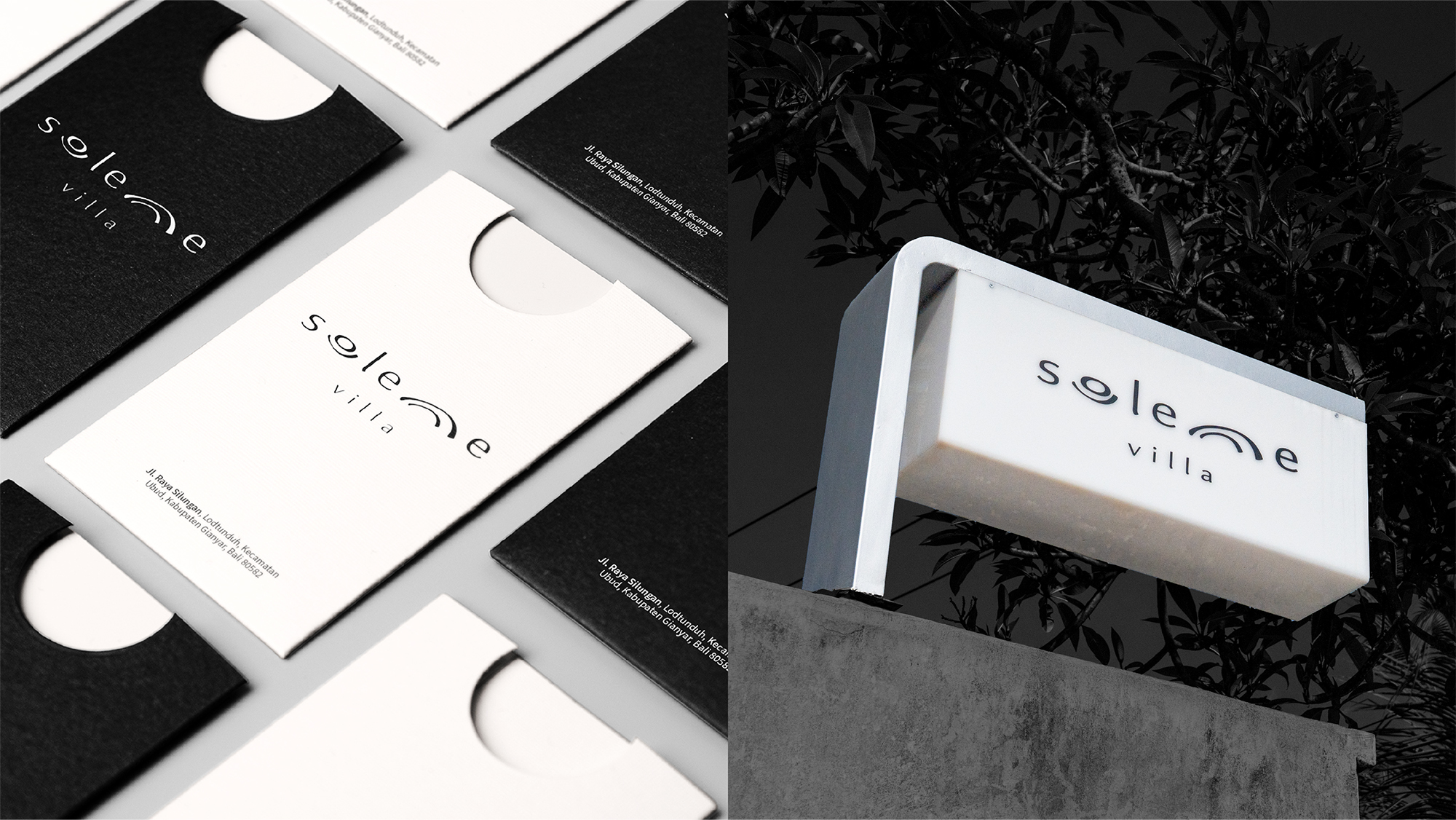
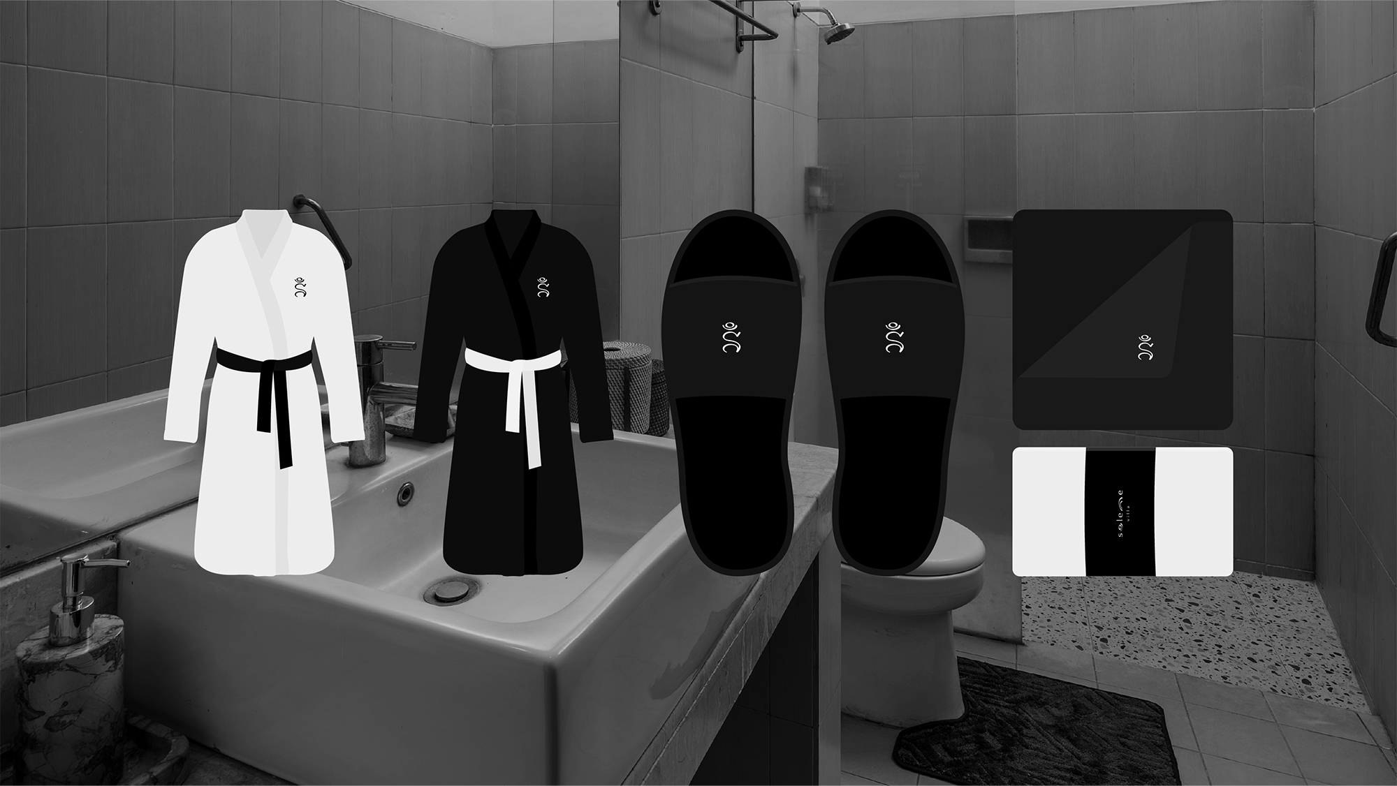
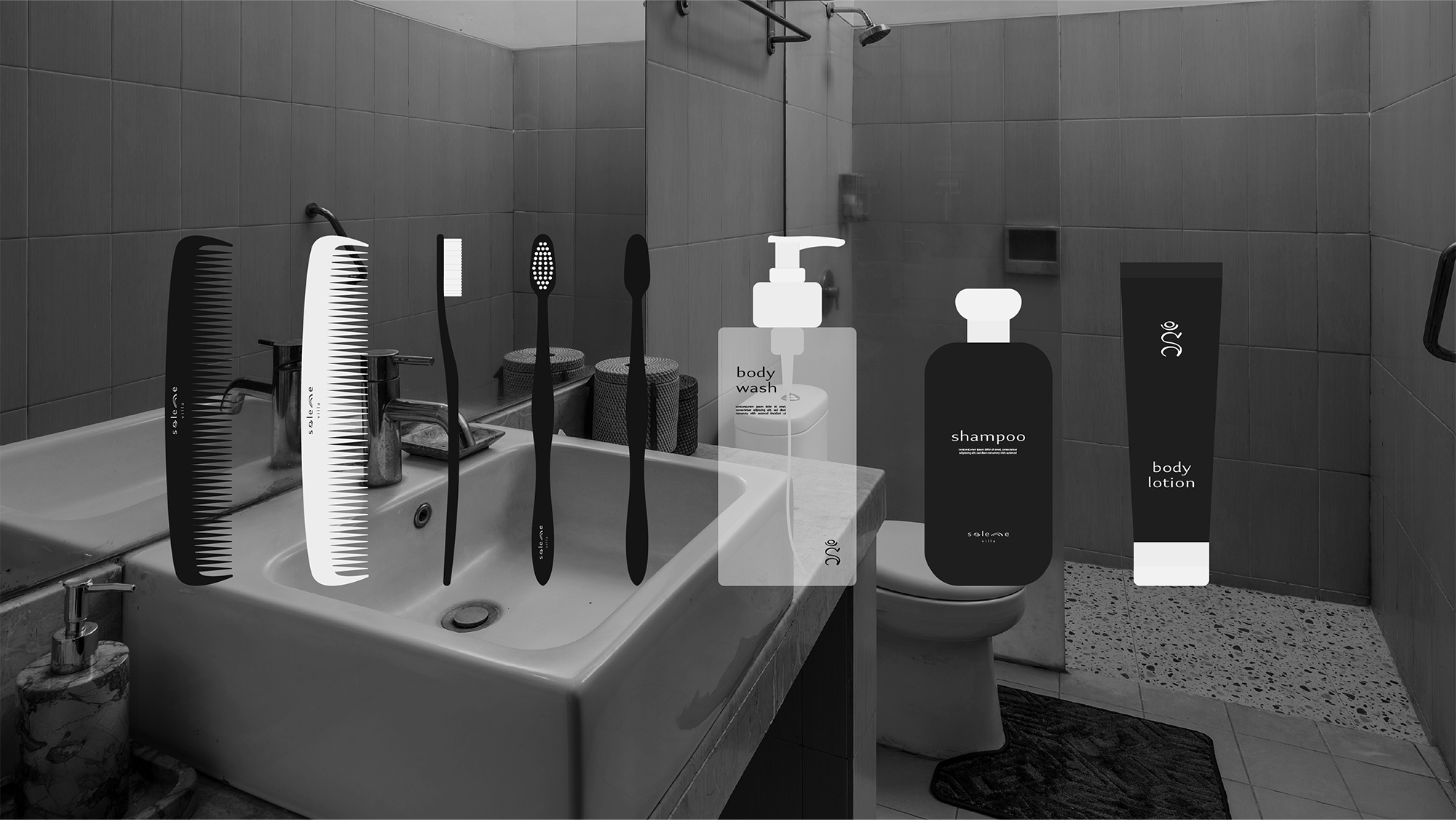
What better inspiration than the universe itself? We decided to use the 'Ong Kara' symbol as the foundation for Solenne's identity. The 'Ong Kara' is the Balinese-Hindu iteration of the sacred 'Om,' representing the sound and vibration of the universe. After sketching several variations, we arrived at our current visual identity: a logotype to accompany the symbol, a strict black-and-white palette referencing the “Poleng" pattern, and a suite of stationery and amenities for the villa.
CHALLANGES
Bayu picked the name Solenne, a spin-off of the French word solennel (solemn), because he wanted guests to feel a sense of calm and tranquility. However, "serenity" has become a ubiquitous buzzword in Bali’s saturated villa market, and because of that, their identities often feel repetitive. We wanted Solenne to stand out—to possess an identity that is grounded, distinct, and truly fitting for Balinese culture. To do that, we had to dive deeper.
DIGGING DEEP
We explored synonyms to help craft an identity that could represent this concept of solemnity in a uniquely Balinese way. We moved beyond simple relaxation toward balance and harmony, discovering that these concepts are crucial in Balinese Hinduism. The Balinese observe a concept called Rwa Bhinneda, which literally means "Two Opposites", a philosophy deeply ingrained within our culture.
Rwa Bhinneda calls for a balance in all things, whether work and leisure, order and chaos, or tradition and progress. We wanted to instill this harmony into Solenne's identity, hoping guests would feel the intention and reverence behind the brand. Now that we had the brand's essence, we needed it to take form.
THE FORM
What better inspiration than the universe itself? We decided to use the 'Ong Kara' symbol as the foundation for Solenne's identity. The 'Ong Kara' is the Balinese-Hindu iteration of the sacred 'Om,' representing the sound and vibration of the universe. After sketching several variations, we arrived at our current visual identity: a logotype to accompany the symbol, a strict black-and-white palette referencing the “Poleng" pattern, and a suite of stationery and amenities for the villa.