Putu Suel Moris Sudiarsana
Putu Kamaiso Chekitana
Petrus Daniel Widi
Wayan Krisna Sangging Wiguna
Kadek Wisnu Leonardo Maldiny
Dewa Ayu Diah Nala
We introduced Japanese minimalism to Kuta through Tsuki’s moon-inspired identity. A refined white-and-gold palette and crescent typography translated "quiet luxury" into tactile details, creating a warm, modern brand voice.


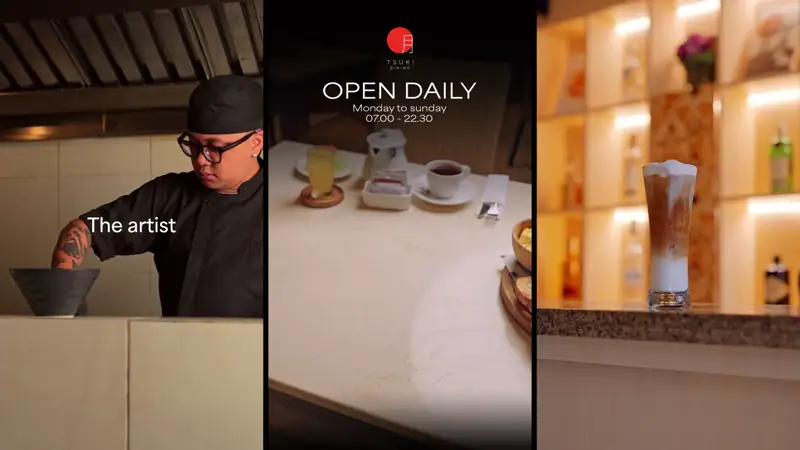
Tsuki Dining aimed to introduce Japanese elegance to the high-energy heart of Kuta. We designed a visual system that feels both refined and welcoming, creating a sanctuary of calm amidst the bustle.
THE VISUAL LANGUANGE
The founders requested an identity that balanced relaxation with refinement, mirroring their promise of quality luxury and heartfelt hospitality. We anchored the brand in the concept of Tsuki (Moon). The wordmark features a gentle curve drawn from the crescent moon, setting the tone for a considered experience.
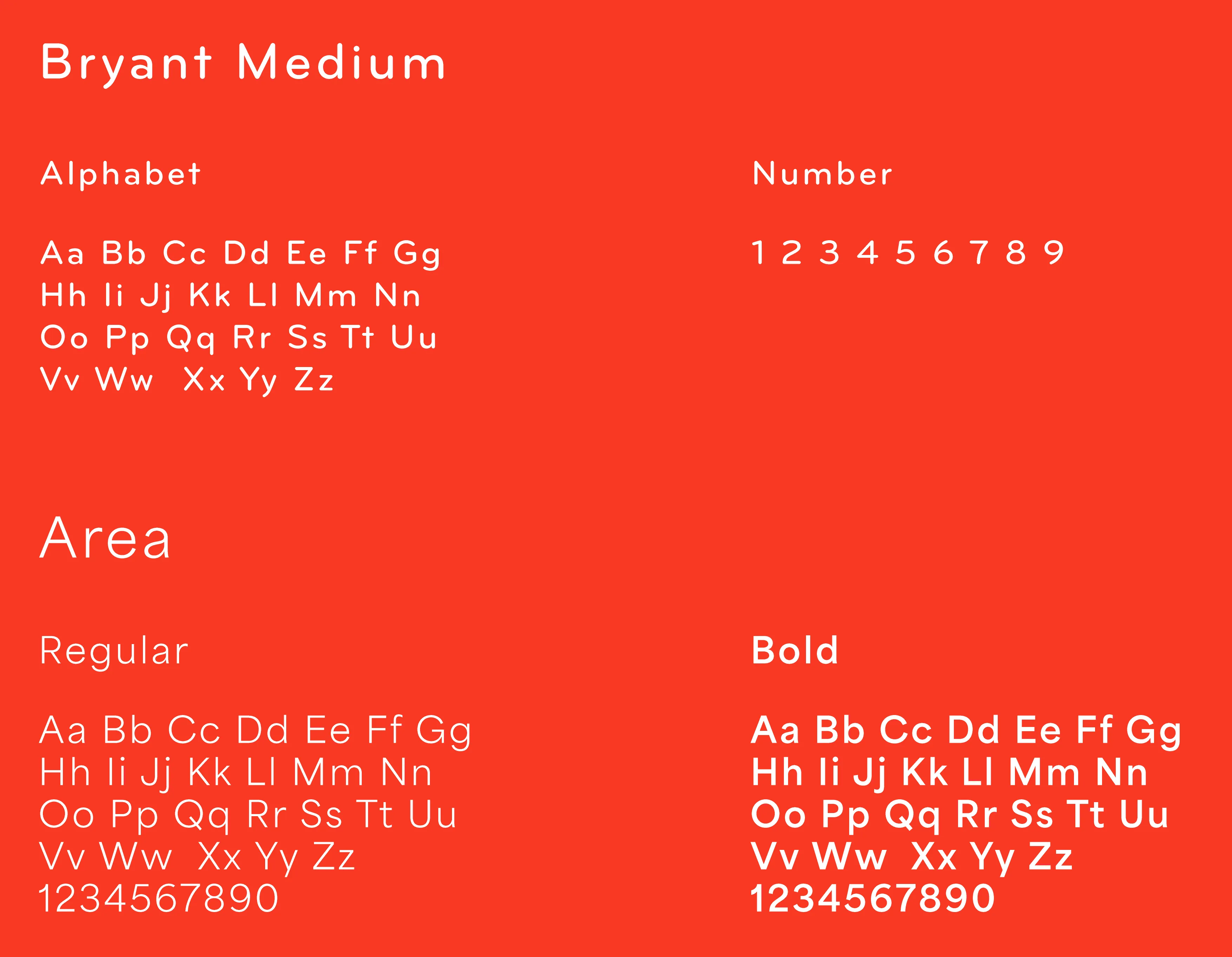
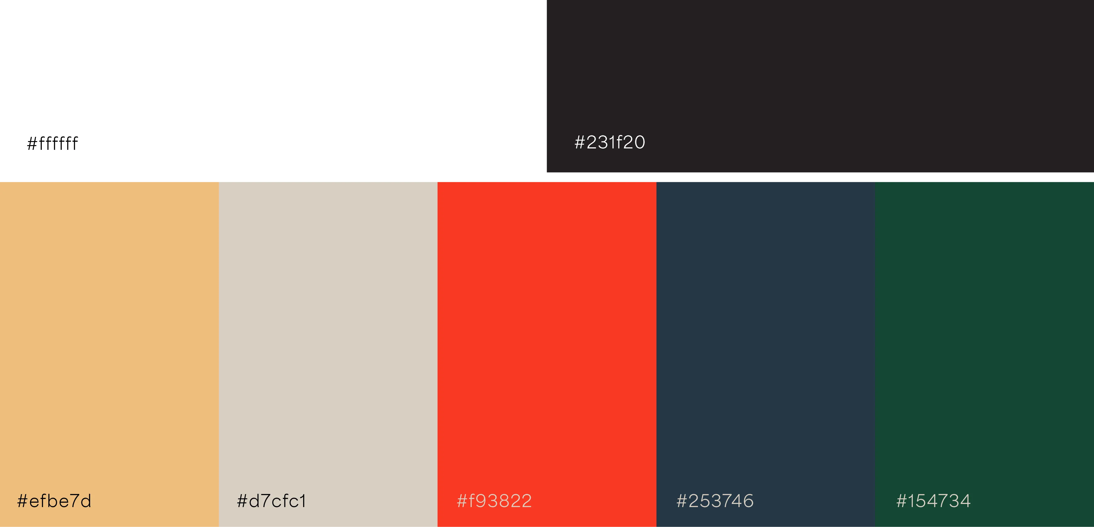
A chalk-white backdrop (#FFFFFF) pairs with deep Ink Black (#231F20) and a warm Moon-Gold accent (#EFBE7D) to create a palette of quiet luxury. A perfect red circle (#F93822) frames the cream-line kanji for Tsuki, signalling balance. Headlines set in Bryant Medium lead the eye with geometric clarity, while body copy in Area ensures menus remain comfortable and accessible.
EXPERIENCE BY DESIGN
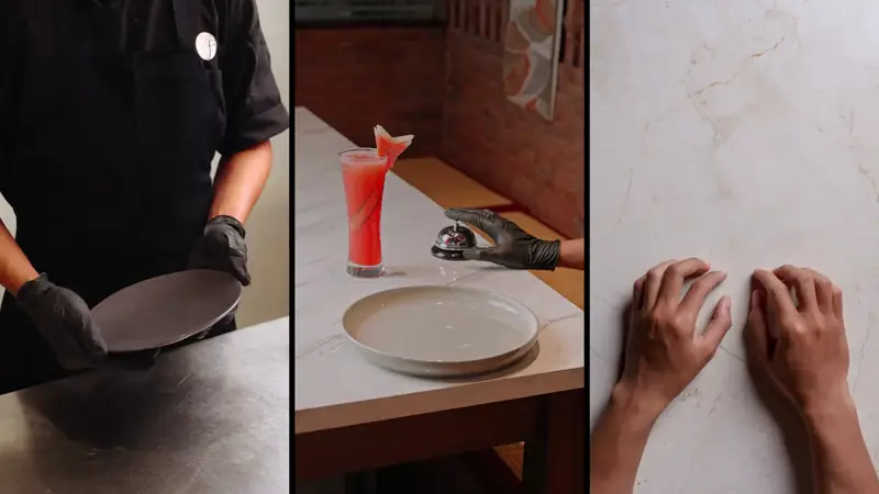
We ensured the brand lived in the tactile details. Menus are printed on thick cream stock with the moon-mark centered at the top margin, creating plenty of white space. Black chopstick sleeves carry the gold crescent alone—a subtle signature at each place setting.
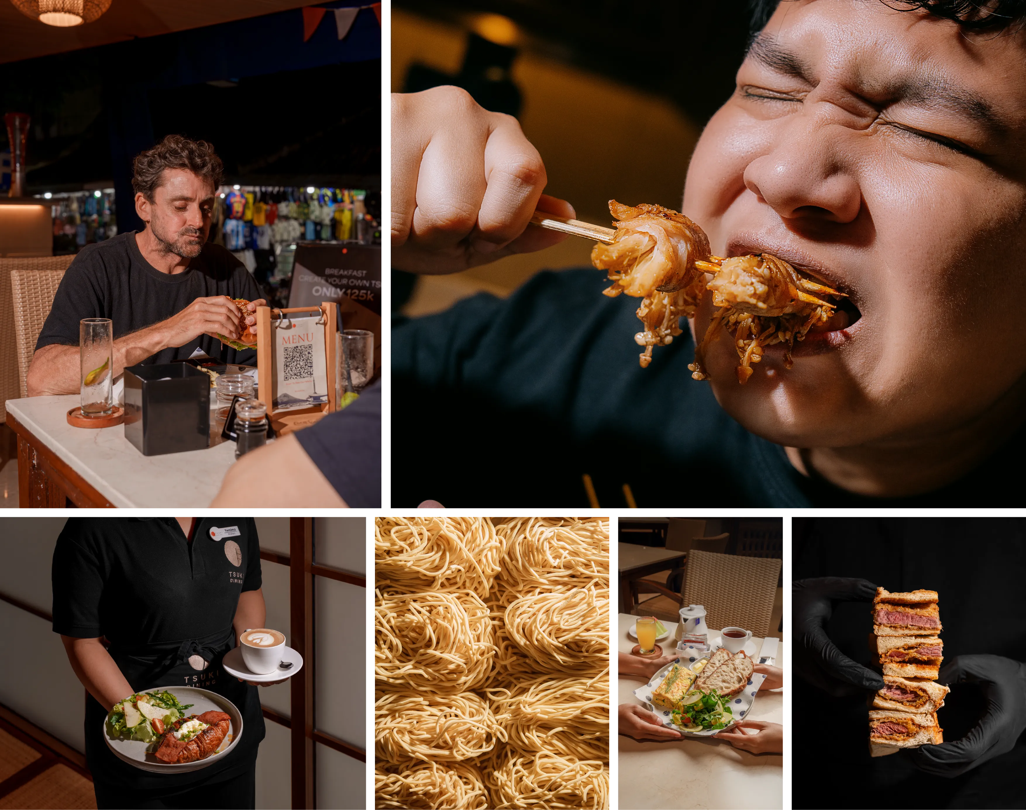
Staff uniforms reflect the relaxed atmosphere: off-white, loose-fit tees featuring a small logo on the chest and a large print across the back. Finally, to-go bags repeat the crescent in a soft, rhythmic pattern, turning a simple carry-out item into a piece of brand theatre. The resulting voice is warm, simple, and modern.
Tsuki Dining aimed to introduce Japanese elegance to the high-energy heart of Kuta. We designed a visual system that feels both refined and welcoming, creating a sanctuary of calm amidst the bustle.
THE VISUAL LANGUANGE
The founders requested an identity that balanced relaxation with refinement, mirroring their promise of quality luxury and heartfelt hospitality. We anchored the brand in the concept of Tsuki (Moon). The wordmark features a gentle curve drawn from the crescent moon, setting the tone for a considered experience.
A chalk-white backdrop (#FFFFFF) pairs with deep Ink Black (#231F20) and a warm Moon-Gold accent (#EFBE7D) to create a palette of quiet luxury. A perfect red circle (#F93822) frames the cream-line kanji for Tsuki, signalling balance. Headlines set in Bryant Medium lead the eye with geometric clarity, while body copy in Area ensures menus remain comfortable and accessible.
EXPERIENCE BY DESIGN
We ensured the brand lived in the tactile details. Menus are printed on thick cream stock with the moon-mark centered at the top margin, creating plenty of white space. Black chopstick sleeves carry the gold crescent alone—a subtle signature at each place setting.
Staff uniforms reflect the relaxed atmosphere: off-white, loose-fit tees featuring a small logo on the chest and a large print across the back. Finally, to-go bags repeat the crescent in a soft, rhythmic pattern, turning a simple carry-out item into a piece of brand theatre. The resulting voice is warm, simple, and modern.