Putu Suel Moris Sudiarsana
Putu Kamaiso Chekitana
Petrus Daniel Widi
For Udiana, we rejected static perfection to honor the "dynamic woman". Through cinematic visuals capturing daily grit, we built an identity that serves as a substantial companion for the woman in motion.

The jewelry industry often whispers to women that they should be delicate, decorative, and still. But when we looked at the women actually wearing the pieces—the mothers, the entrepreneurs, the keepers of culture—we saw something entirely different. We saw constant movement. The team behind Udiana approached us to build a brand that didn't just adorn a woman, but kept pace with her.
BEYOND DECORATION
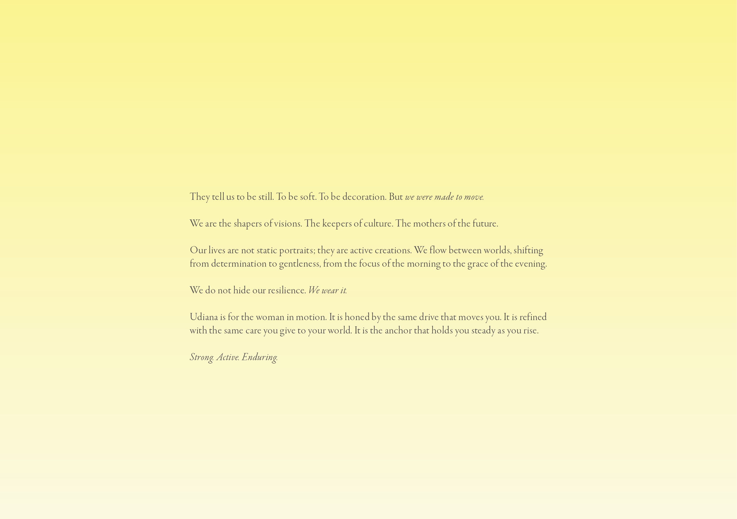
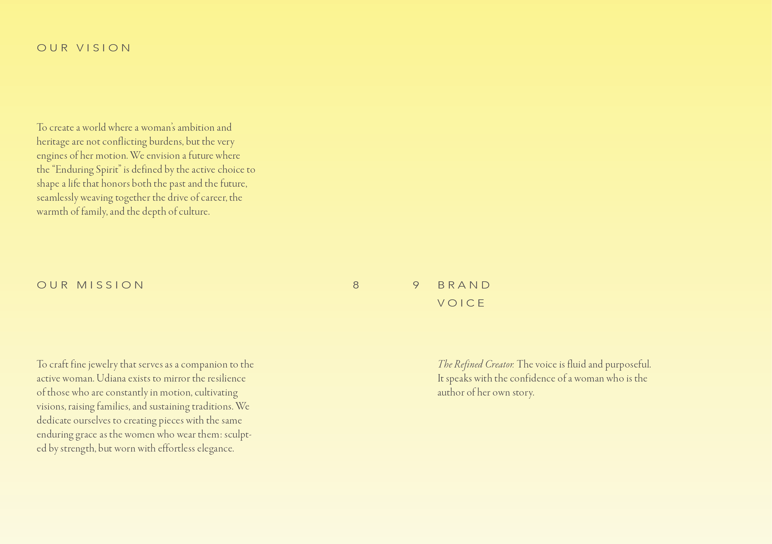
The challenge was to dismantle the "static portrait" archetype. Many brands frame heritage and ambition as conflicting burdens, forcing a choice between the past and the future. Udiana needed to be the bridge. We wanted to create an identity that proved a woman’s ambition is the very engine of her motion. We realized that for the Udiana woman, resilience isn't something she hides; it’s something she wears.
THE REFINED CREATOR
To give this vision a voice, we developed the persona of "The Refined Creator". We moved away from flowery, passive language and adopted a tone that is active and purposeful. We focused on verbs of construction—cultivating, weaving, shaping, and curating. The messaging needed to validate hard work, highlighting the beauty of resilience rather than the weight of the struggle. This wasn't about hollow decoration; it was about honoring the "daily practice" of ambition.
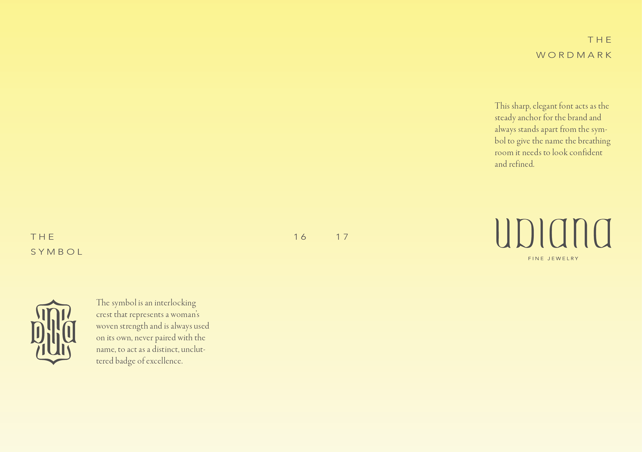
A BADGE OF EXCELLENCE
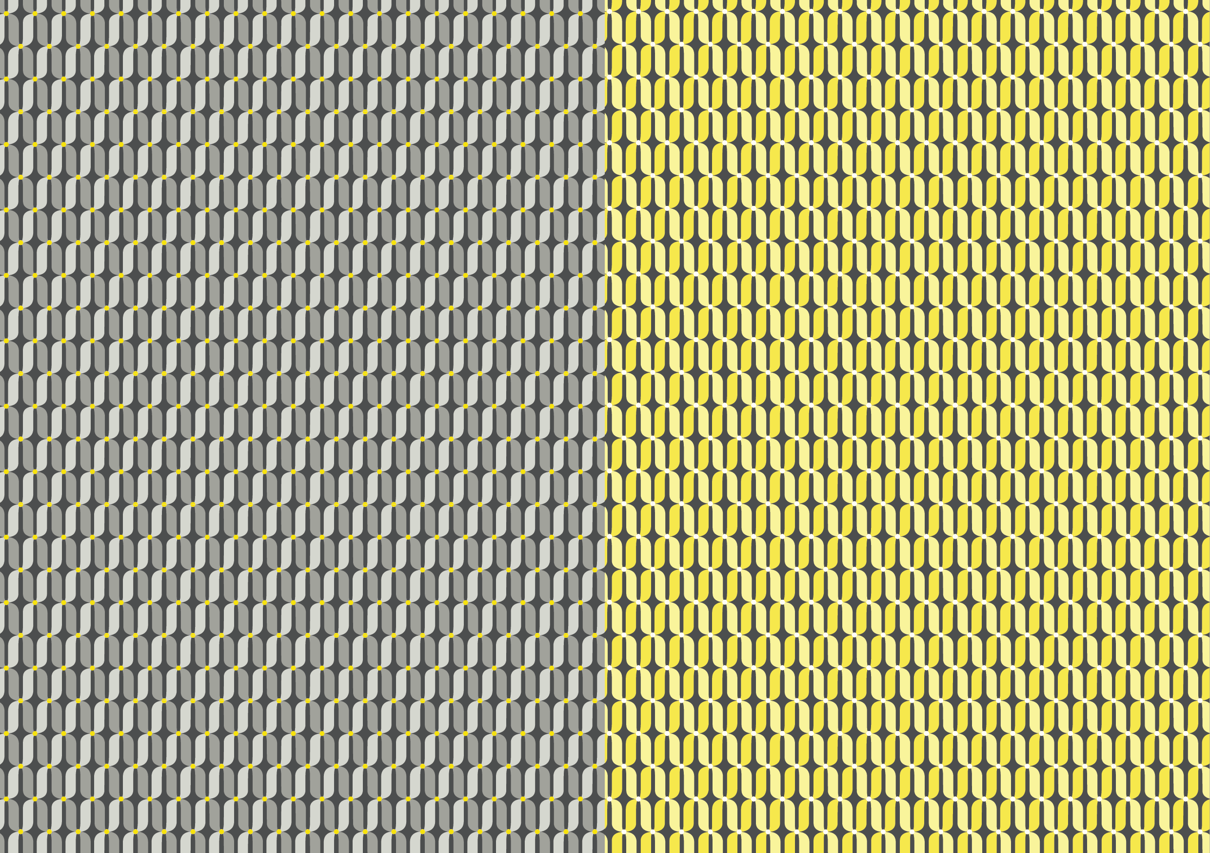
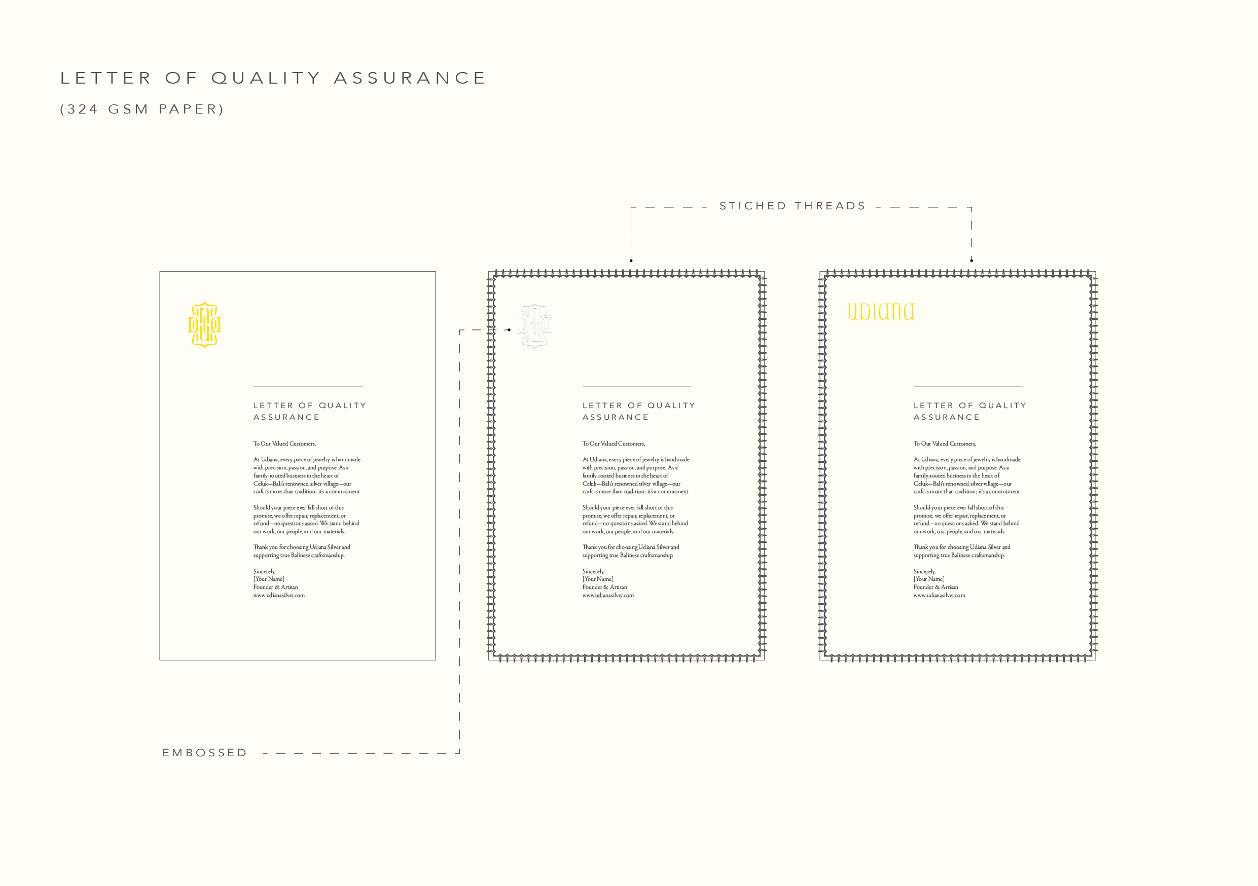
Visually, we needed a symbol that felt like an anchor. We designed an interlocking crest representing woven strength. Unlike typical delicate jewelry branding, this symbol is designed to stand on its own as a distinct, uncluttered badge of excellence. We paired this with a substantial silver product design, honed to be unbreakable—mirroring the endurance of the woman wearing it.
CINEMATIC REALITY
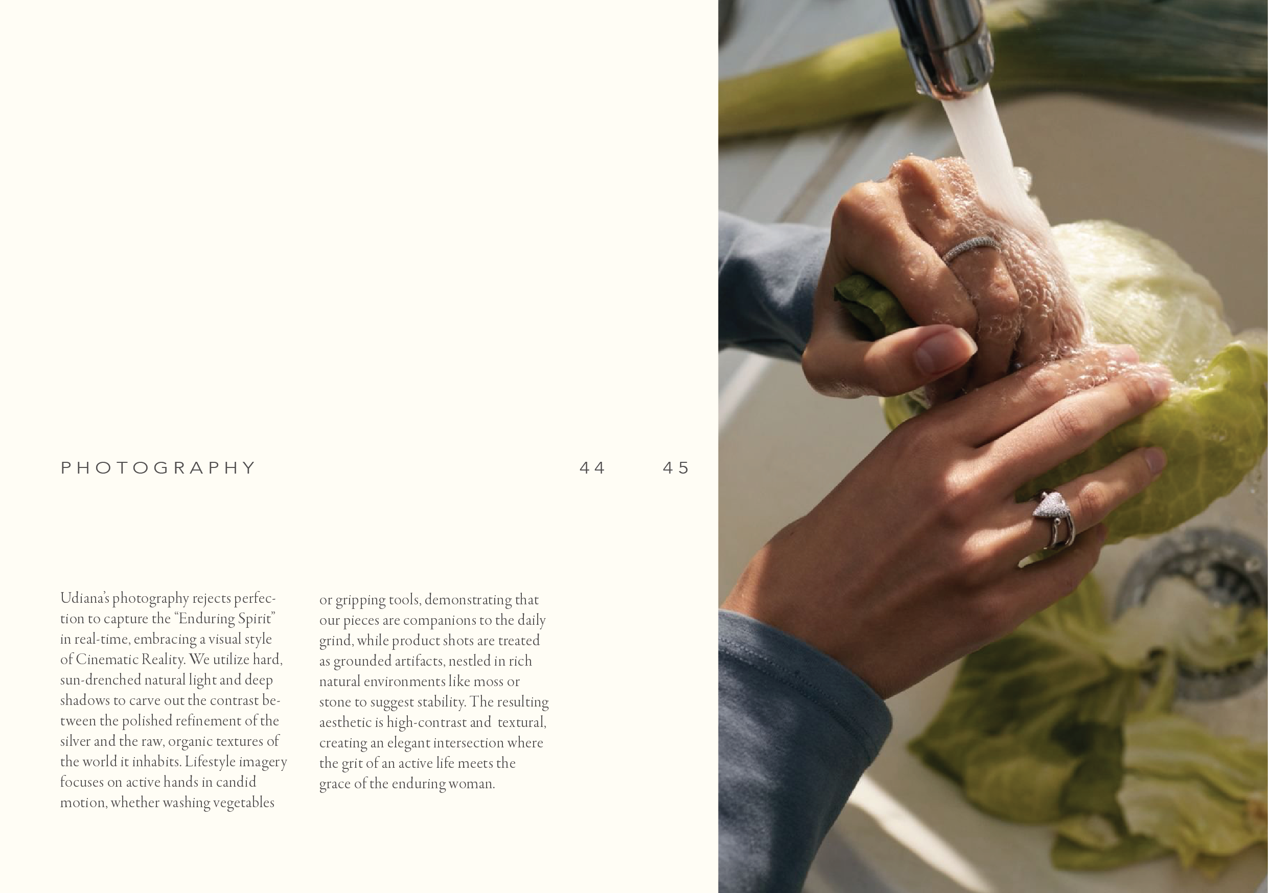
The final piece of the puzzle was the imagery. We rejected the industry standard of perfection for a style we call "Cinematic Reality". We utilized hard, sun-drenched natural light and deep shadows to carve out a contrast between the polished silver and the raw textures of the world. By featuring hands in candid motion—gripping tools or washing vegetables—we positioned Udiana not as a fragile accessory, but as a grounded companion to the daily grind.
The jewelry industry often whispers to women that they should be delicate, decorative, and still. But when we looked at the women actually wearing the pieces—the mothers, the entrepreneurs, the keepers of culture—we saw something entirely different. We saw constant movement. The team behind Udiana approached us to build a brand that didn't just adorn a woman, but kept pace with her.
BEYOND DECORATION
The challenge was to dismantle the "static portrait" archetype. Many brands frame heritage and ambition as conflicting burdens, forcing a choice between the past and the future. Udiana needed to be the bridge. We wanted to create an identity that proved a woman’s ambition is the very engine of her motion. We realized that for the Udiana woman, resilience isn't something she hides; it’s something she wears.
THE REFINED CREATOR
To give this vision a voice, we developed the persona of "The Refined Creator". We moved away from flowery, passive language and adopted a tone that is active and purposeful. We focused on verbs of construction—cultivating, weaving, shaping, and curating. The messaging needed to validate hard work, highlighting the beauty of resilience rather than the weight of the struggle. This wasn't about hollow decoration; it was about honoring the "daily practice" of ambition.
A BADGE OF EXCELLENCE
Visually, we needed a symbol that felt like an anchor. We designed an interlocking crest representing woven strength. Unlike typical delicate jewelry branding, this symbol is designed to stand on its own as a distinct, uncluttered badge of excellence. We paired this with a substantial silver product design, honed to be unbreakable—mirroring the endurance of the woman wearing it.
CINEMATIC REALITY
The final piece of the puzzle was the imagery. We rejected the industry standard of perfection for a style we call "Cinematic Reality". We utilized hard, sun-drenched natural light and deep shadows to carve out a contrast between the polished silver and the raw textures of the world. By featuring hands in candid motion—gripping tools or washing vegetables—we positioned Udiana not as a fragile accessory, but as a grounded companion to the daily grind.